Branding is an important area for any business but especially for an online business. Your business logo is often the first thing new customers see and what they will use to form their first impression of your business. While your icon helps existing customers recognize and attribute your content and posts.
Last year I decided to rebrand PaperDemon.com because I was unhappy with what we had. Our existing logos and icons lacked personality, didn’t meet various practical needs and didn’t communicate what we were about.
Typographical logo
Up until circa 2019, the logo looked something like this and we used this for 10 years. The typeface was very thin which didn’t show up well on small sizes and it also lacked a lot of personality and character.
Temporarily I had changed it to this hand lettered logo in some places but it still lacked a lot of personality and was missing the wing.
Today’s tech world is full of forgettable logos. So often I see companies following modern trends and just copying what the big boys like Google and Apple do without doing anything unique or special.
I knew I didn’t want to make the same mistake. I intentionally wanted to do something different. The thought of reaching out to a design agency didn’t sound attractive because with the budget I am on I knew I’d get something forgettable. Even the experienced and pricey agencies may not be able to get me something that would work given that graphic design and illustration are wholely separate skills and what I wanted was something that required the skills of an illustrator.
Good thing I know someone who has experience with both (haha, I mean me). But, in all seriousness, while branding is not by any means my area of expertise I did get some experience in this area while I worked at Google and I felt confident if I focused on it I could come up with something.
I wanted to do something that was more akin to our 2005 logo which was also hand lettered. I liked the character and feel of it, but as you can see below it lacked balance. What the heck are those shapes hanging off of the P and the D? You can see this logo like the new one you’re about to see also uses Celtic letters.
Using an existing font and just making a logo out of that was NOT going to cut it. We are an art and writing community after all. Our logo has to be one of a kind and artsy. There’s no way I would be able to find a typeface that would do what I wanted it to do. So I knew going into this rebrand that I would be hand lettering this thing.
Some of the keywords I wanted my logo to evoke were paper, story book, fantasy, and fairy tale. Having a list of words of what you want your brand to evoke can help guide the creative process.
My inspiration for it was Celtic illuminated manuscripts, Celtic knots, and the title cards for early animated Disney films (think Pinocchio and Sleeping Beauty).
We also use a Celtic font and Celtic knots for some of our other marketing imagery so going this direction also makes things feel more cohesive.
I also wanted the wing to become a part of the logo again, much like it was in the 2009 version. I also wanted the letters to have a worn out look to have a visual connection to “paper”. This was something I did for the lettering I had done for the 2020 Red Curtain Erotic Fantasy calendar project and I had liked the results so I decided to carry over those elements. If you look closely, you can see little notches in the letters.
I am SUPER happy with the results of this. I fully intend to keep this logo for a while.
The only down side is, again, this logo doesn’t look the greatest at small sizes because of how detailed it is. I do have a simplified variant of it though, scaled smaller here for demonstration purposes
Social icon rebrand
In addition to rebranding the typographical logo, I also updated the social icons.
What I had previously was the wing from the 2009 logo colored green and on a green background with foliage textures. It’s something that I had created somewhat quickly back when we first created our social channels and it wasn’t very high resolution. This made it difficult to use in print marketing materials.
I felt the demon wing concept was really strong as a brand element. It is simple enough that it scales down to small sizes well, is memorable, and relates well to the name “PaperDemon”. So I carried over this concept to the new icons.
Here’s the updated one using the new wing which was designed with the new typographical logo. I’m not completely happy with the colors so I might change the colors/textures again later this year. But the overall shape of it is pleasing.
Site footer
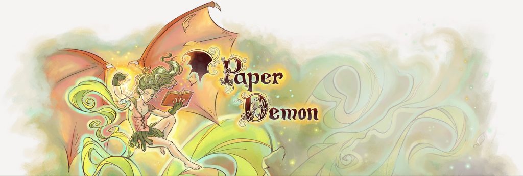
For many years, PaperDemon.com had a demon illustration in the footer along with the logo for the site. This illustration would get rotated out with a new one every now and then. Over the years, this tradition was stopped due in part to my artist block, my time constraints, and also due to complexities involved with making the site layout work well on mobile.
I’ve had a strong desire for years to bring this tradition back and with the launch of the new logo, decided now was a great time to do it. I also had a great demon illustration I had created recently that made for a good fit. So this is the new footer that now resides on the bottom of PaperDemon.com. The advantage is I can make the illustration and the logo pretty large to show off it’s detail because it appears in the site footer as opposed to the header where it might be annoying for users to scroll past constantly.
I hope this post inspired you to thoughtfully consider your branding for your own business or website.