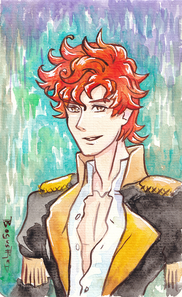
Just a quick post to share recent works I’ve been painting. These are all roughly 4″x6″. I often do these during group therapy sessions.
Winsor & Newton watercolor, QoR watercolor, gouache, white gel pen.
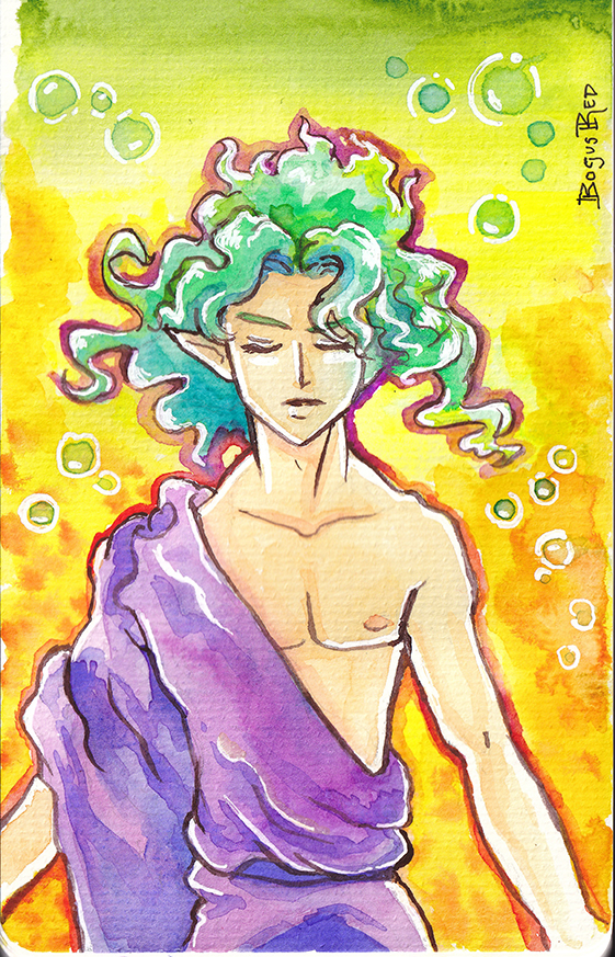
Just a quick post to share recent works I’ve been painting. These are all roughly 4″x6″. I often do these during group therapy sessions.
Winsor & Newton watercolor, QoR watercolor, gouache, white gel pen.
I attend weekly group therapy video calls and I’ve taken to doodling in my little watercolor sketchbook during them.
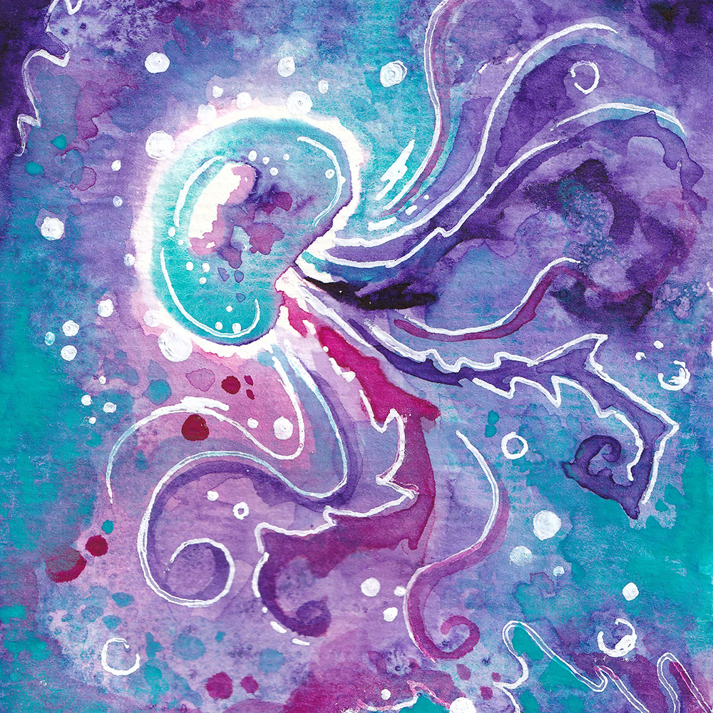
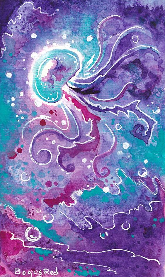
I recently bought myself a starter set of 6 QoR high chroma Watercolor paints after seeing a few Youtube artists pimp them and did a little experimenting with them. The above jellyfish painting was the result.
Here’s the exact set of paints I bought. The set comes with 6 tubes.
I don’t like to work from tubes (too chaotic and wasteful) so I bought myself this little empty pan set and squeezed the paints out into pans.
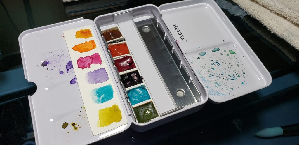
This is something I stupidly never thought you could do. I always thought people who used paint from tubes were either ok with the waste or perfect at estimating how much paint they’d need. It wasn’t until I saw Art youtubers like Emily Artful tour their supplies that I learned this was a thing. So I pass on this knowledge to you!
Beware though because apparently not all tube watercolor paints work well in pans. Do research first.
With the QoR, there’s a ton of pigment in there and it lays on DARK. There is high paint load in these, which is a nice contrast to working with Winsor & Newton watercolor (my usual jam). I feel with the Winsor & Newton pan paints, I have to do several layers of colors like purple, blue or green to get the bright, rich, intense color I want. Which is frustrating if you’re like me and like to rely on the lovely bleeding/blending effects of watercolor which can’t as easily be done if you have to do it in layers (or maybe I’m just not good at doing it that way).
It also spreads out very fast, which can create some beautiful blooms. I still have some more experimenting to do with it. But this will make them harder to control.
They react well to salt, maybe even more so than Winsor & Newton.
I was also surprised to discover the Cobalt Teal is opaque allowing me to paint light on dark. It felt more like a gouache. I also love the Cobalt Teal and Quinacridone Magenta because these are colors I don’t have available in my Winsor & Newton pan set.
YES! I LOVE bright colors so these were the perfect paints for me to expand my collection with.
But I need more practice with them. This jellyfish doodle just doesn’t do the paints justice. More experimentation to come.
If you’re new to watercolor medium, these are not the paints I would start with. There aren’t enough variety of colors here, they’re harder to control and lift, and they’re pricy. But if you’ve already gotten your feet wet and are looking to expand your colors or options, these are definitely worth checking out.
Medium: QoR high chroma watercolors, white jelly pen
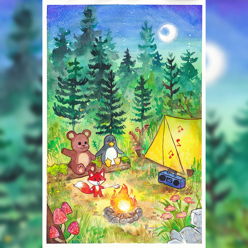
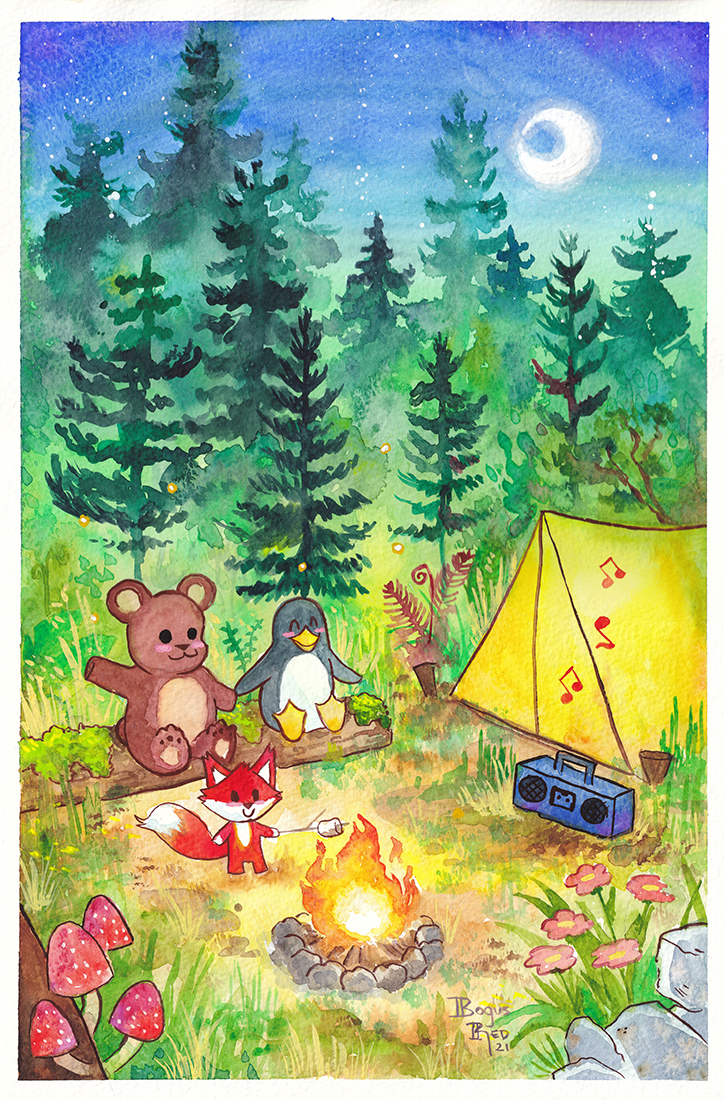
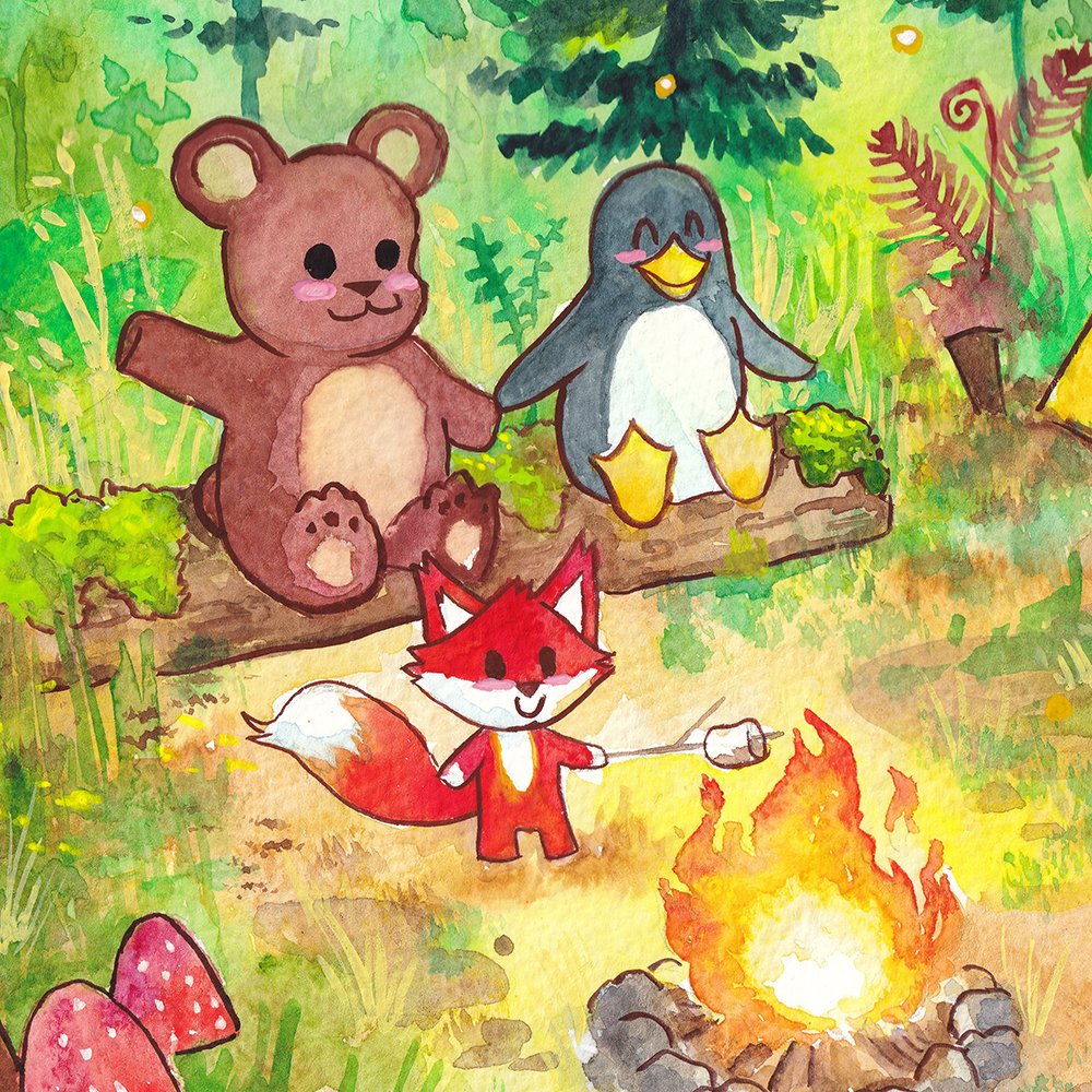
Here’s the first finished art piece of 2021. This piece is dedicated to Wilder.
This is a gift for my new nephew who was just born a few weeks ago. This will hang in his nursery. His parents love the outdoors and camping. They also love penguins and bears so I combined these loves together into a unique gift just for their family.
Medium: Winsor & Newton Pan Watercolors, Holbein Gouache, Winsor & Newton Gouache
Paper: 300 Series Strathmore Watercolor paper
I thought I’d detail behind the scenes how this art piece was created so you can see what my process is like. I’ll eventually create a time lapse video of the final painting.
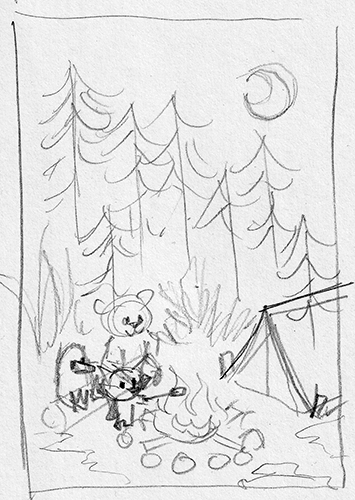
It all started with a thumbnail sketch. This is only a couple inches tall. I start most illustrations doing thumbnail sketches to try different compositions and ideas. For most illustrations I’ll do several thumbnail sketches until I land on something I like. For this illustration, I had the basic composition in my head already and one thumbnail was enough.
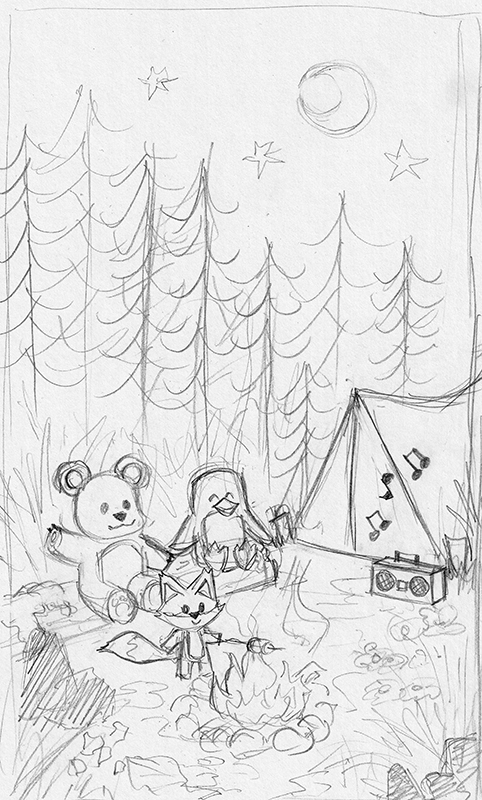
I then went on to create a more refined sketch in my sketchbook to better work out the composition in more detail. The composition roughly follows the rule of thirds with the forest and sky taking up the upper two thirds of the paper.
The elements in the illustration are personalized to the family that this gift is for. They love the outdoors and camping. They had decided to paint the nursery green and go with an outdoors theme. Wilder’s dad loves bears and Wilder’s mom loves penguins so it only made sense for them to be there. They also love listening to music. At every family gathering they’re supplying the music.
I included elements on the lower left and right to help frame the composition. I intentionally chose for the trees to have a diagonal line down toward the right which helps lead the eye into the tent and music which leads your eye into the main focal point of the piece, our little critters.
I chose a fox because of the bright colors and contrast it would have against the greens.
As you note in the final piece, the trees in the distance look almost like they’re in fog which creates a lot of beauty in the piece. This is achieved by using wet on wet techniques for the trees in the distance and using wet on dry technique for the foreground trees.
Part of the technique for making this look so beautiful is letting the colors bleed into one another and is my absolute favorite aspect of watercolors. I’m big into color and nothing gets my jimmies going like seeing all those pretty colors bleeding into one another.
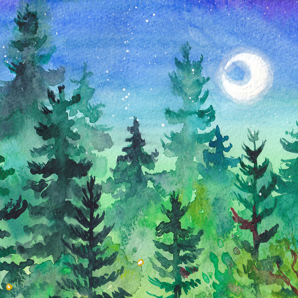
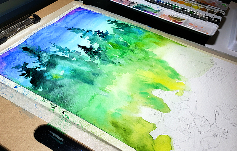
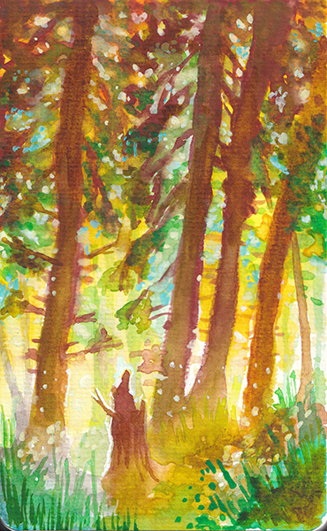
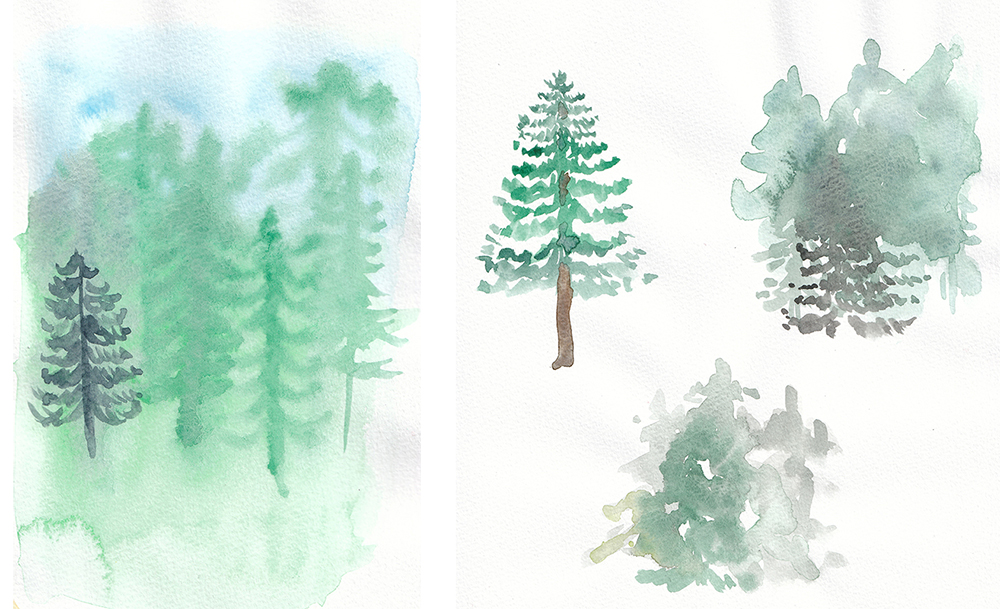
I watched this tutorial on how to paint pine trees with watercolor and found it incredibly helpful. I’d never painted anything like this before so I needed to get some practice with it before starting the final illustration. I made several attempts, some of which were failures but I wanted to share these so you can see that it’s normal and part of the process to have failures like this. This is why many professional illustrators will do practice studies like this so you can work on the new techniques in isolation without worrying about ruining the final piece.
I realized after these attempts that the cheaper watercolor paper I used for the practice may have contributed to the lackluster results. These were done with Winsor & Newton watercolors on Soho sketch series paper (it’s not very good paper for final pieces but is ok for practice).
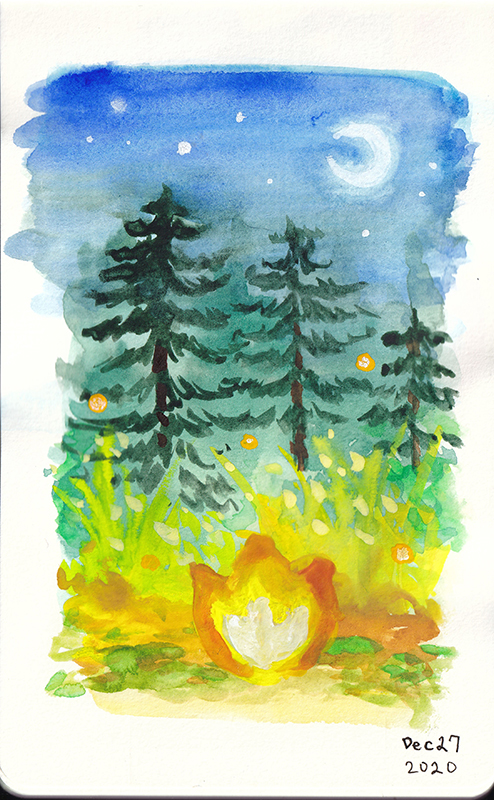
For many illustrations that I do, I do a series of “color comps” or “color studies” to try out different combinations of colors to see what will work best together. Sometimes, I have a clear idea in my head of what the colors should be. I went ahead and did a quick color study to test out the colors. I only did one color comp this time because I was satisfied with the first one.
The colors didn’t bleed as nice here because I ended up using the wrong side of the paper by mistake. Oops! But regardless, I was happy with the overall color structure.
I also did some practices with painting the moon. In order to get a smooth sky, I would not be able to simply avoid painting over the moon. Painting the sky required straight smooth strokes wet on wet. So I’d either have to mask it or paint white on top or lift the paint to get the moon.
I experimented with a few options:
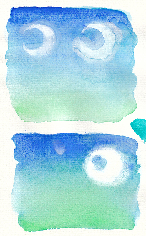
Something I didn’t include here is I also did several practices of the sky by itself attempting to get a smooth gradient using wet on wet techniques. The moon studies also served as additional practice for this technique.
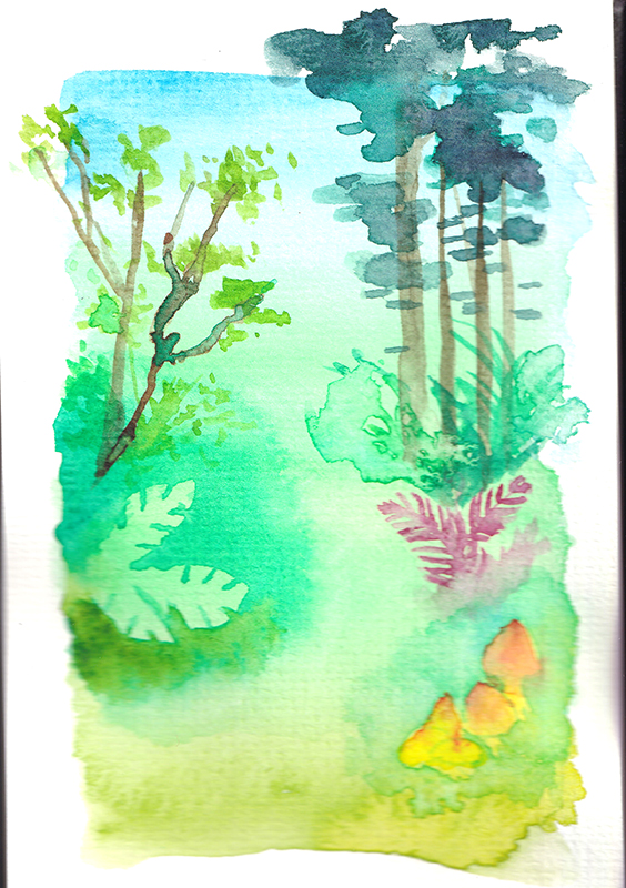
I also did a study practicing some foliage. I wasn’t totally happy with the foliage I ended up with in the final piece. I think I could have used some more practice here but I had already invested what I felt was enough time in learning new techniques that I was ready to just move on to the final.
When I was ready to work on the final, I redrew my sketch onto the watercolor paper. I didn’t want to do the initial sketch on watercolor paper because a lot of erasing can disturb the surface of the paper and influence the way the paints sit and bleed. So I had to redraw (in pencil) onto the watercolor paper.
The vast majority of the piece was painted with watercolors. But outlines for the characters and the yellow grasses were painted with gouache. I used gouache for the outlines because it gives me a consistent dark line, something that’s hard to achieve with watercolor. I also used it for the yellow grasses because gouache is opaque which allows you to paint light colors onto dark colors. That’s something you can’t achieve with watercolor because of it’s translucency.
The stars were achieved by using white gouache and splattering them onto the page.
Here are a few things I thought could be better with the piece
And there you have it. The finished piece. This was definitely my most ambitious watercolor painting. Overall I’m happy with the results and I’m glad I attempted it. It definitely gives me more confidence in working with watercolor.
I hope you enjoyed this write up and learned something from it. Happy painting.