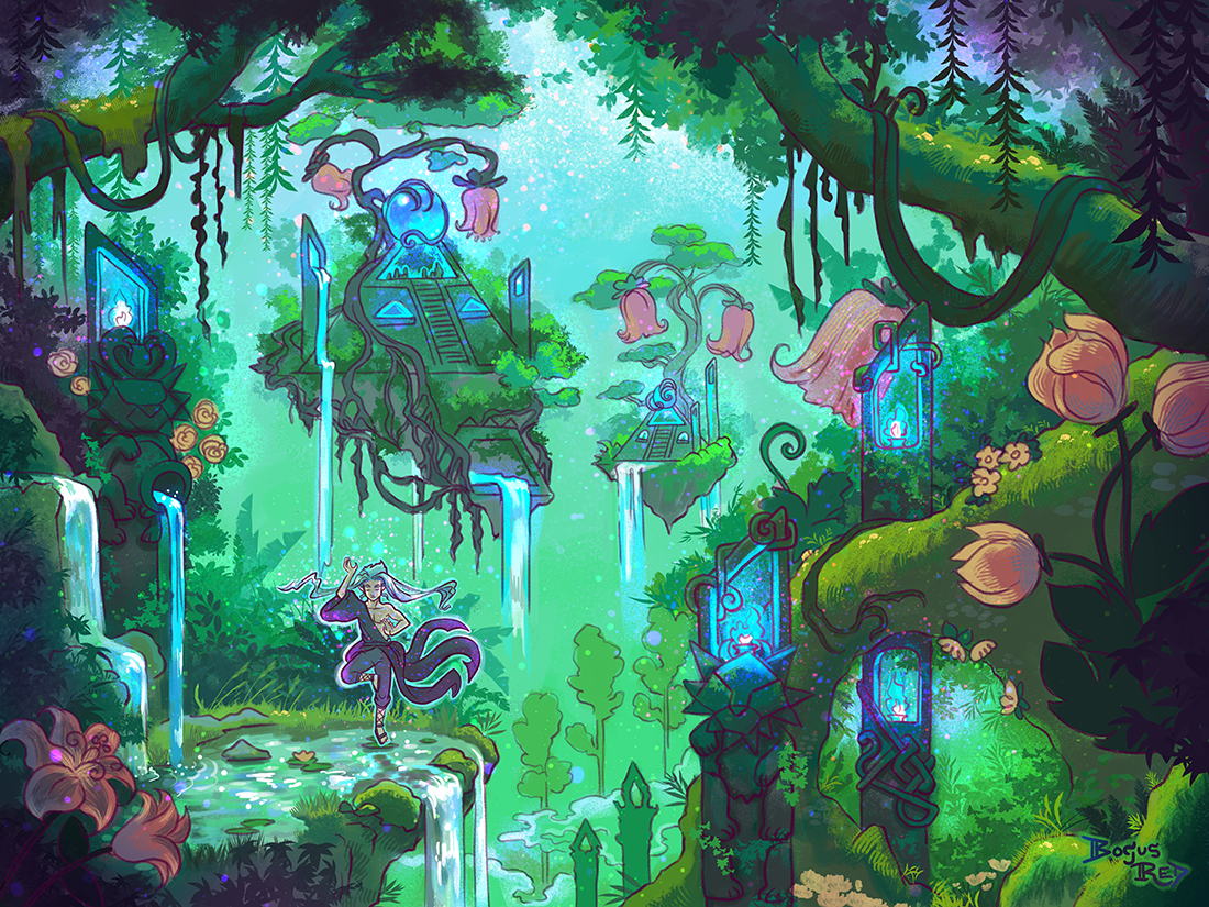
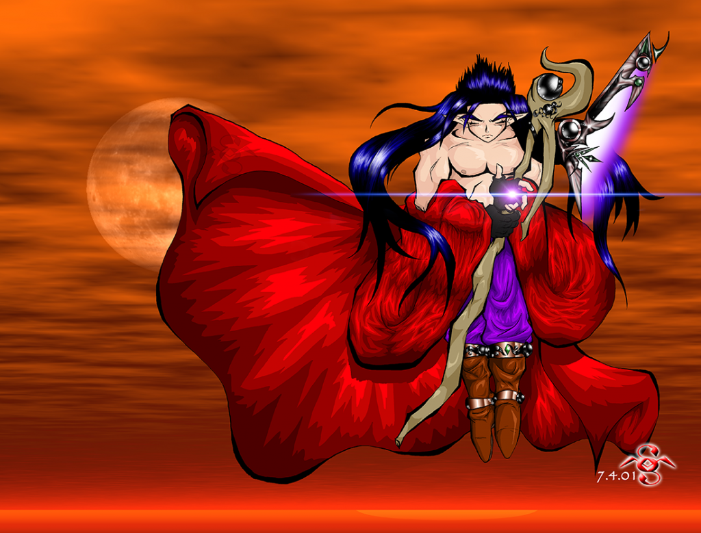
This is the original art I made in 2001. Back then my art had a lot more Akira Toriyama influence. You can see the basic concept I had for weapons in the game exited from a long time ago. The background in this art was generated by Kais Power Tools if I remember right. I wasn’t very good at making backgrounds back then.
Jerle weapon / 2001
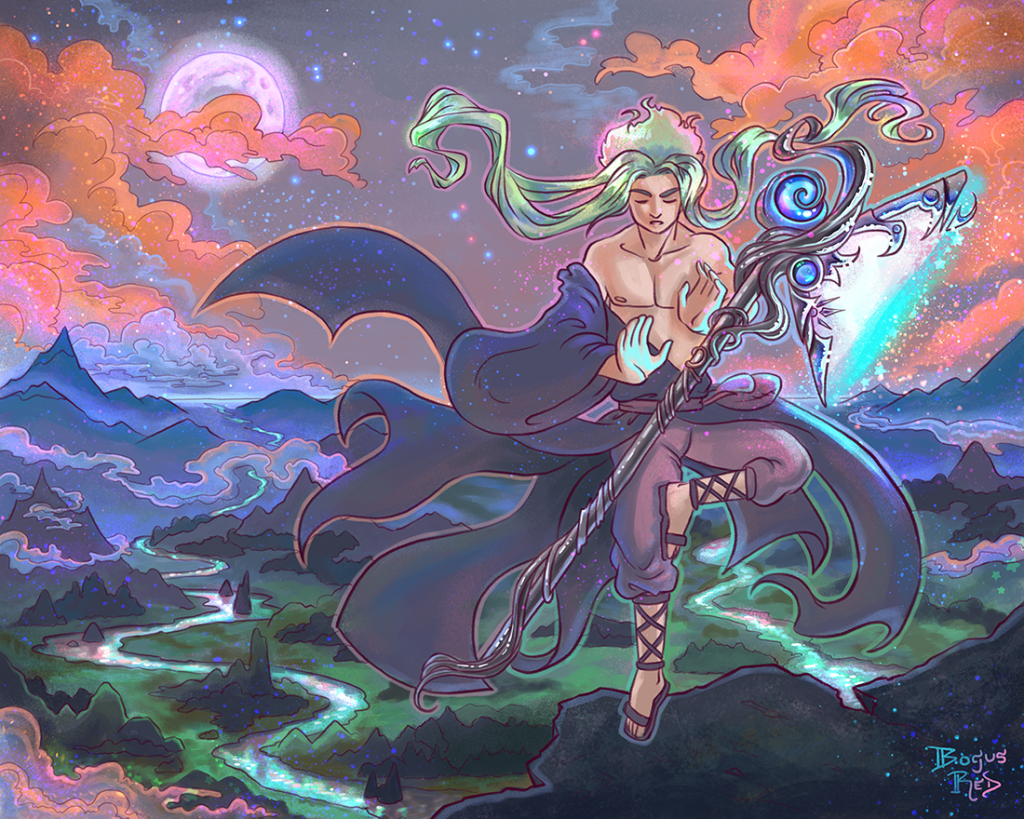
And this is the redrawn version with a background I drew and painted myself. Jerle’s clothing was redesigned a couple years ago to look a little more interesting by having tails and an asymmetrical design. Usually I don’t draw his hair this long though.
Jerle weapon / 2022
I rarely do redraws. I’m really happy with how this turned out and may do another one.
As for life updates, I had a baby in February! I should probably make a post about that. I’m also struggling with postpartum depression. Need to make a post about that, too.
Some day I’ll make a good habit of posting to here more consistently.
My passion for PaperDemon comes from the pain I felt as a child, not really fitting in, feeling stupid, and having poor self esteem. With the discord server we can really provide support for those that are struggling and help members to see themselves more positively. The community is so wonderfully supportive and I want to grow it further.
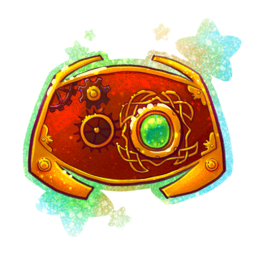
We’re getting a lot of new sign ups on the PaperDemon website but a small percentage of them are in the discord server.
So to solve this I want to promote paperdemons discord server more prominently on the homepage. Since the icon will sit alongside all of our other major game icons, I wanted it to match the PaperDemon art rpg look and feel (fantasy and steampunk) so I created this icon. I thought it turned out pretty good.
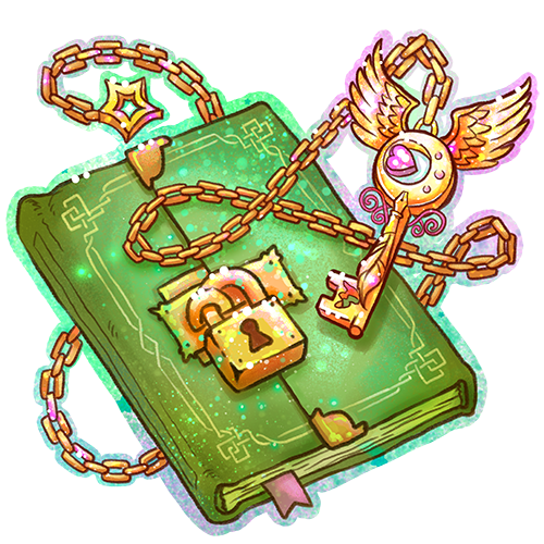
On PaperDemon we just introduced biweekly challenges as part of the PaperDemon Art RPG where a new prompt is introduced every two weeks that encourages players to explore their OC’s personalities and preferences.
But anyway here’s the art I created to signify these challenges.
Since these challenges centered around character development, Shyftlock suggested a “journal” be used for the graphic. But after doing some research I decided to go with something more like a locked diary to give it a little more of a steampunk feel.
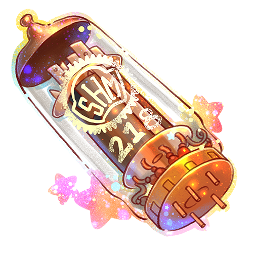
I created a new item for the PaperDemon Art RPG called a Junket Tank. The visual is based on a vacuum tube like one that might be used inside a tube tv.
In the PaperDemon universe, portals to other worlds are tube television sets. Some portals are unstable, only able to be visited during specified times of 2 months.
I had the idea to add an item that would let players visit these closed portals and one of our members, Duskfire suggested it be a part from a TV set.
The “SHM 218” is a reference to ShrunkenHeadMan club, the San Jose State University Animation/Illustration club that I was very active in while studying there and have still contributed to after graduating. I’m not as active these days but try to make it to the yearly SHM Con event at least.
Soon we’ll be introducing a new crafting challenge to the PaperDemon Art RPG. And so I needed to create some new item art.
I have a lot of fun creating the item art for the PaperDemon Art RPG. Part of it is because it’s a lot easier than character art, I can get fairly creative with it, and I can usually finish an item in 1-2 days.
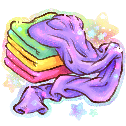
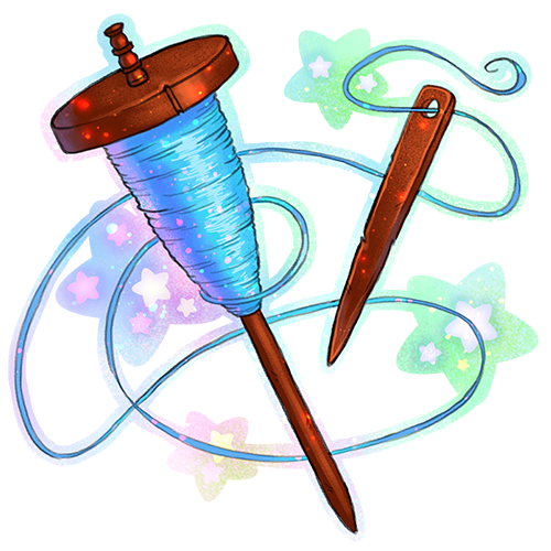
ClothThread
The spindle for the thread was inspired by ancient thread spindles.
The only thing I wish I had done differently with the art is that the lines for the cloth are too thick compared to the other item art. I might have to go back and fix that later.
Anyway, you can craft Cloth and Thread together to make this Cloth armor.
I did some art for two currencies for the PaperDemon Art RPG.
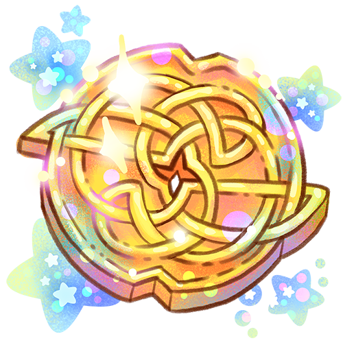
We’re using Gold as the main in-game currency. Gold drops for participating in most of the events. I was inspired by Celtic knots for the design as well as Japanese coins, some of which have a hole in the middle. Celtic designs are an influence in other PaperDemon Art RPG assets as well.
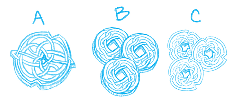
I actually had three different concepts that I was trying to choose between.
Three different concept sketches for gold currency
I went for option A because I thought it felt more Elvan. I also thought this worked better as a singular coin instead of three coins because of the level of detail in it.
I may still use option C for another currency later. I liked the little notches.
And here’s the final.
Final art for Gold
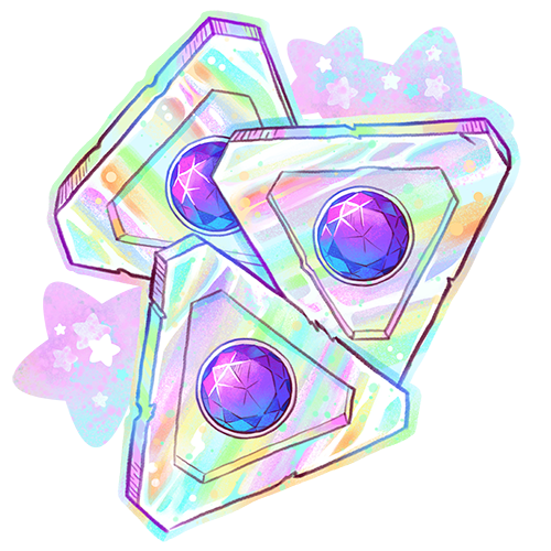
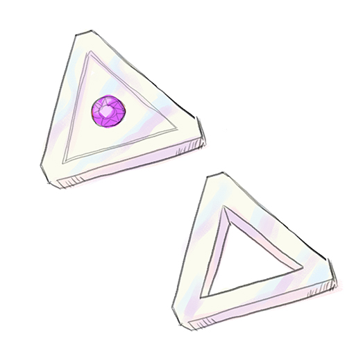
And soon we’re going to introduce a new premium currency called “Trokens.” I wanted the currency to have a non-circular shape just to be a little more interesting. There was a conspiracy involving me and Triforces in the past so I thought it would be funny to make the currency triangular shaped. When I told my husband I was trying to come up with a name for the currency, he suggested “Trokens” because it’s a combo of tokens and triangle and we both busted out laughing. So I rolled with it.
Here are two early concept sketches. One had a gem in the middle and another had a hole in the middle, again kind of like the Japanese Yen coins. I ended up going with the gem in the center as this felt more “premium”. Also I like shiny things and gems are shiny. I was thinking of the base as being like a pearlescent material.
Trokens Concept sketches
And here’s the final art. Once again I turned up the rainbows and sparkles to level 11.
Trokens final art
I’m pleased with the art and can’t wait to announce these for sale. Hoping to officially launch the store in the next week or two. However I’m still building out the list of items that will be available for purchase with this currency. So I’m unsure how interested people will be in buying at this point.
If you’ve known me long enough, you probably know I have ADHD (Attention Deficit Hyper Activity Disorder). My ADHD has made my life a challenge in many ways, and one of which is motivation.
This is one of the reasons I am so passionate about gamifying art and supporting the Art RPG community. I see Art RPGs as a fun way to help motivate neurodivergent artists to get past their perfectionism and motivational challenges and get creating again by bribing them with virtual gold, XP, and more.
Recently, I was invited to be interviewed on the ADHD Artist Podcast to talk all about Art RPGs and how they can benefit the ADHD artist community.
I had a lot of fun chatting with the host, Sarah Guise. We talked about Google doodles, disclosing your disability at school and in the workplace, PaperDemon, and Art RPGs. Actually there’s a TON more that I feel like we could have talked about. I hope I get the chance to come on again because ADHD is one of those topics that I have passionate opinions on.
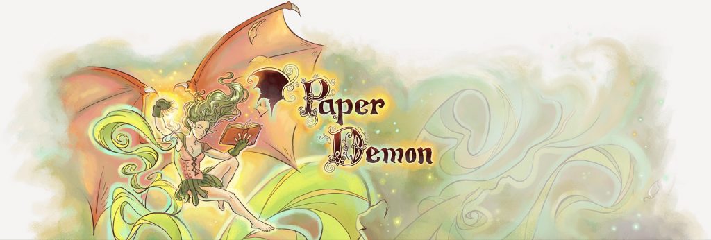
Branding is an important area for any business but especially for an online business. Your business logo is often the first thing new customers see and what they will use to form their first impression of your business. While your icon helps existing customers recognize and attribute your content and posts.
Last year I decided to rebrand PaperDemon.com because I was unhappy with what we had. Our existing logos and icons lacked personality, didn’t meet various practical needs and didn’t communicate what we were about.
Typographical logo
Up until circa 2019, the logo looked something like this and we used this for 10 years. The typeface was very thin which didn’t show up well on small sizes and it also lacked a lot of personality and character.
Circa 2009 logo
Temporarily I had changed it to this hand lettered logo in some places but it still lacked a lot of personality and was missing the wing.
2019 logo
Today’s tech world is full of forgettable logos. So often I see companies following modern trends and just copying what the big boys like Google and Apple do without doing anything unique or special.
I knew I didn’t want to make the same mistake. I intentionally wanted to do something different. The thought of reaching out to a design agency didn’t sound attractive because with the budget I am on I knew I’d get something forgettable. Even the experienced and pricey agencies may not be able to get me something that would work given that graphic design and illustration are wholely separate skills and what I wanted was something that required the skills of an illustrator.
Good thing I know someone who has experience with both (haha, I mean me). But, in all seriousness, while branding is not by any means my area of expertise I did get some experience in this area while I worked at Google and I felt confident if I focused on it I could come up with something.
I wanted to do something that was more akin to our 2005 logo which was also hand lettered. I liked the character and feel of it, but as you can see below it lacked balance. What the heck are those shapes hanging off of the P and the D? You can see this logo like the new one you’re about to see also uses Celtic letters.
2005 logo
Using an existing font and just making a logo out of that was NOT going to cut it. We are an art and writing community after all. Our logo has to be one of a kind and artsy. There’s no way I would be able to find a typeface that would do what I wanted it to do. So I knew going into this rebrand that I would be hand lettering this thing.
Some of the keywords I wanted my logo to evoke were paper, story book, fantasy, and fairy tale. Having a list of words of what you want your brand to evoke can help guide the creative process.
My inspiration for it was Celtic illuminated manuscripts, Celtic knots, and the title cards for early animated Disney films (think Pinocchio and Sleeping Beauty).
We also use a Celtic font and Celtic knots for some of our other marketing imagery so going this direction also makes things feel more cohesive.
I also wanted the wing to become a part of the logo again, much like it was in the 2009 version. I also wanted the letters to have a worn out look to have a visual connection to “paper”. This was something I did for the lettering I had done for the 2020 Red Curtain Erotic Fantasy calendar project and I had liked the results so I decided to carry over those elements. If you look closely, you can see little notches in the letters.
PaperDemon.com 2020 logo horizontal
I am SUPER happy with the results of this. I fully intend to keep this logo for a while.
The only down side is, again, this logo doesn’t look the greatest at small sizes because of how detailed it is. I do have a simplified variant of it though, scaled smaller here for demonstration purposes
PaperDemon.com 2020 logo simplified version for small sizes
Social icon rebrand
In addition to rebranding the typographical logo, I also updated the social icons.
What I had previously was the wing from the 2009 logo colored green and on a green background with foliage textures. It’s something that I had created somewhat quickly back when we first created our social channels and it wasn’t very high resolution. This made it difficult to use in print marketing materials.
Circa 2015 social icon
I felt the demon wing concept was really strong as a brand element. It is simple enough that it scales down to small sizes well, is memorable, and relates well to the name “PaperDemon”. So I carried over this concept to the new icons.
Here’s the updated one using the new wing which was designed with the new typographical logo. I’m not completely happy with the colors so I might change the colors/textures again later this year. But the overall shape of it is pleasing.
2020 PaperDemon Icon
Site footer
For many years, PaperDemon.com had a demon illustration in the footer along with the logo for the site. This illustration would get rotated out with a new one every now and then. Over the years, this tradition was stopped due in part to my artist block, my time constraints, and also due to complexities involved with making the site layout work well on mobile.
I’ve had a strong desire for years to bring this tradition back and with the launch of the new logo, decided now was a great time to do it. I also had a great demon illustration I had created recently that made for a good fit. So this is the new footer that now resides on the bottom of PaperDemon.com. The advantage is I can make the illustration and the logo pretty large to show off it’s detail because it appears in the site footer as opposed to the header where it might be annoying for users to scroll past constantly.
I hope this post inspired you to thoughtfully consider your branding for your own business or website.