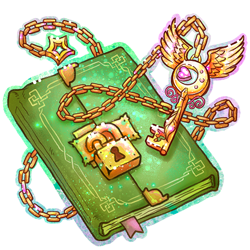
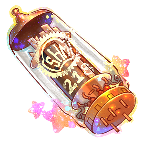
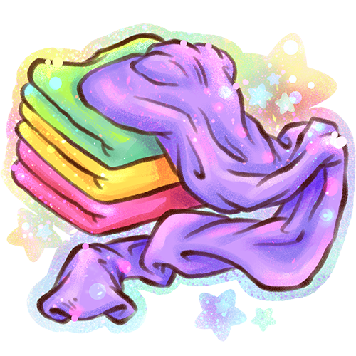
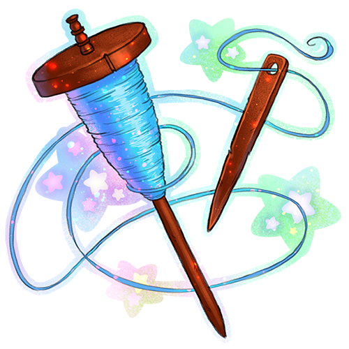
Soon we’ll be introducing a new crafting challenge to the PaperDemon Art RPG. And so I needed to create some new item art.
I have a lot of fun creating the item art for the PaperDemon Art RPG. Part of it is because it’s a lot easier than character art, I can get fairly creative with it, and I can usually finish an item in 1-2 days.
The spindle for the thread was inspired by ancient thread spindles.
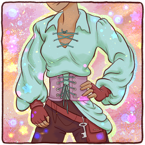
The only thing I wish I had done differently with the art is that the lines for the cloth are too thick compared to the other item art. I might have to go back and fix that later.
Anyway, you can craft Cloth and Thread together to make this Cloth armor.
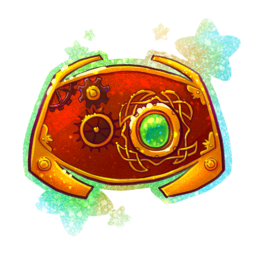
I did some art for two currencies for the PaperDemon Art RPG.
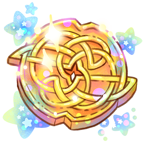
We’re using Gold as the main in-game currency. Gold drops for participating in most of the events. I was inspired by Celtic knots for the design as well as Japanese coins, some of which have a hole in the middle. Celtic designs are an influence in other PaperDemon Art RPG assets as well.
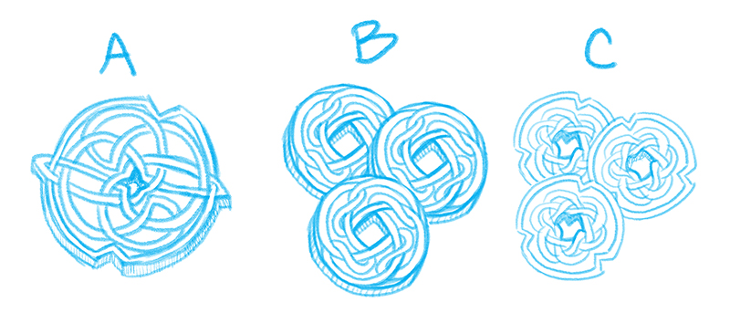
I actually had three different concepts that I was trying to choose between.
I went for option A because I thought it felt more Elvan. I also thought this worked better as a singular coin instead of three coins because of the level of detail in it.
I may still use option C for another currency later. I liked the little notches.
And here’s the final.
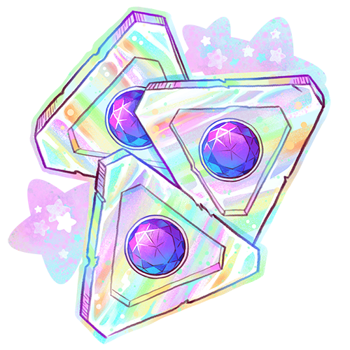
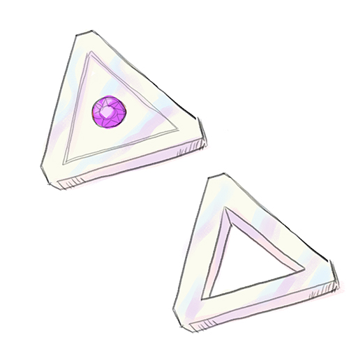
And soon we’re going to introduce a new premium currency called “Trokens.” I wanted the currency to have a non-circular shape just to be a little more interesting. There was a conspiracy involving me and Triforces in the past so I thought it would be funny to make the currency triangular shaped. When I told my husband I was trying to come up with a name for the currency, he suggested “Trokens” because it’s a combo of tokens and triangle and we both busted out laughing. So I rolled with it.
Here are two early concept sketches. One had a gem in the middle and another had a hole in the middle, again kind of like the Japanese Yen coins. I ended up going with the gem in the center as this felt more “premium”. Also I like shiny things and gems are shiny. I was thinking of the base as being like a pearlescent material.
And here’s the final art. Once again I turned up the rainbows and sparkles to level 11.
I’m pleased with the art and can’t wait to announce these for sale. Hoping to officially launch the store in the next week or two. However I’m still building out the list of items that will be available for purchase with this currency. So I’m unsure how interested people will be in buying at this point.
If you’ve known me long enough, you probably know I have ADHD (Attention Deficit Hyper Activity Disorder). My ADHD has made my life a challenge in many ways, and one of which is motivation.
This is one of the reasons I am so passionate about gamifying art and supporting the Art RPG community. I see Art RPGs as a fun way to help motivate neurodivergent artists to get past their perfectionism and motivational challenges and get creating again by bribing them with virtual gold, XP, and more.
Recently, I was invited to be interviewed on the ADHD Artist Podcast to talk all about Art RPGs and how they can benefit the ADHD artist community.
I had a lot of fun chatting with the host, Sarah Guise. We talked about Google doodles, disclosing your disability at school and in the workplace, PaperDemon, and Art RPGs. Actually there’s a TON more that I feel like we could have talked about. I hope I get the chance to come on again because ADHD is one of those topics that I have passionate opinions on.
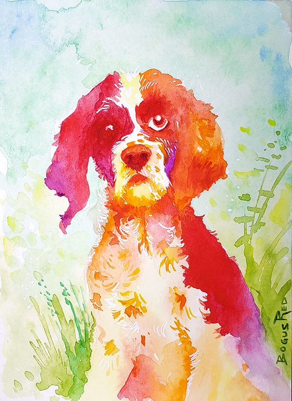
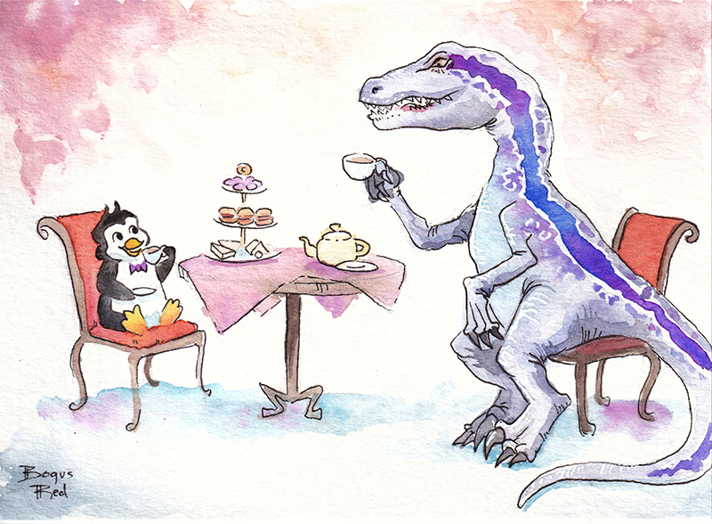
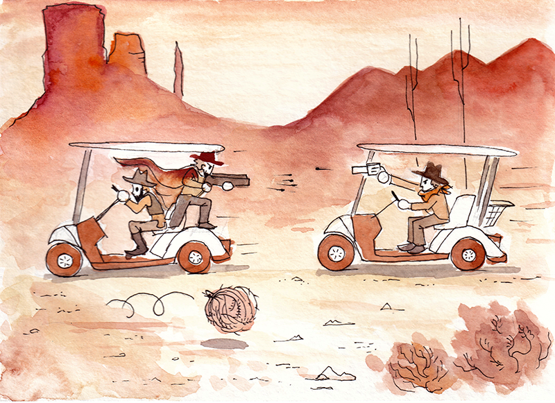
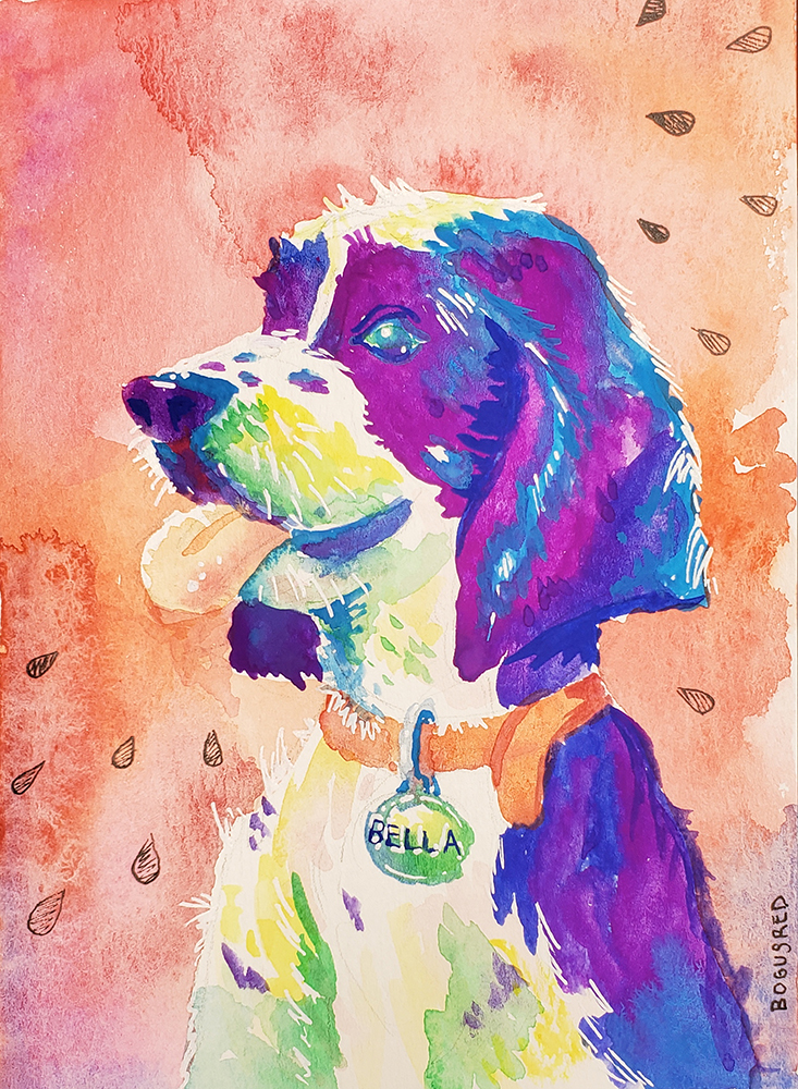
I don’t take commissions but I do like creating unique gifts for family. Here are a few watercolor greeting cards I made in 2019-2020 for birthdays. They reflect the personal interests of the recipients.
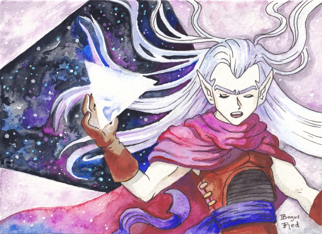
I played Octopath Traveler on Nintendo Switch in 2019 and loved it. I found myself getting attached to Cyrus Albright. I just found his personality and dialog very amusing and likable.
So I made a few fanart pieces of him over the past two years. Here they are all together. His hair is especially fun to draw and paint.
Branding is an important area for any business but especially for an online business. Your business logo is often the first thing new customers see and what they will use to form their first impression of your business. While your icon helps existing customers recognize and attribute your content and posts.
Last year I decided to rebrand PaperDemon.com because I was unhappy with what we had. Our existing logos and icons lacked personality, didn’t meet various practical needs and didn’t communicate what we were about.
Typographical logo
Up until circa 2019, the logo looked something like this and we used this for 10 years. The typeface was very thin which didn’t show up well on small sizes and it also lacked a lot of personality and character.
Temporarily I had changed it to this hand lettered logo in some places but it still lacked a lot of personality and was missing the wing.
Today’s tech world is full of forgettable logos. So often I see companies following modern trends and just copying what the big boys like Google and Apple do without doing anything unique or special.
I knew I didn’t want to make the same mistake. I intentionally wanted to do something different. The thought of reaching out to a design agency didn’t sound attractive because with the budget I am on I knew I’d get something forgettable. Even the experienced and pricey agencies may not be able to get me something that would work given that graphic design and illustration are wholely separate skills and what I wanted was something that required the skills of an illustrator.
Good thing I know someone who has experience with both (haha, I mean me). But, in all seriousness, while branding is not by any means my area of expertise I did get some experience in this area while I worked at Google and I felt confident if I focused on it I could come up with something.
I wanted to do something that was more akin to our 2005 logo which was also hand lettered. I liked the character and feel of it, but as you can see below it lacked balance. What the heck are those shapes hanging off of the P and the D? You can see this logo like the new one you’re about to see also uses Celtic letters.
Using an existing font and just making a logo out of that was NOT going to cut it. We are an art and writing community after all. Our logo has to be one of a kind and artsy. There’s no way I would be able to find a typeface that would do what I wanted it to do. So I knew going into this rebrand that I would be hand lettering this thing.
Some of the keywords I wanted my logo to evoke were paper, story book, fantasy, and fairy tale. Having a list of words of what you want your brand to evoke can help guide the creative process.
My inspiration for it was Celtic illuminated manuscripts, Celtic knots, and the title cards for early animated Disney films (think Pinocchio and Sleeping Beauty).
We also use a Celtic font and Celtic knots for some of our other marketing imagery so going this direction also makes things feel more cohesive.
I also wanted the wing to become a part of the logo again, much like it was in the 2009 version. I also wanted the letters to have a worn out look to have a visual connection to “paper”. This was something I did for the lettering I had done for the 2020 Red Curtain Erotic Fantasy calendar project and I had liked the results so I decided to carry over those elements. If you look closely, you can see little notches in the letters.
I am SUPER happy with the results of this. I fully intend to keep this logo for a while.
The only down side is, again, this logo doesn’t look the greatest at small sizes because of how detailed it is. I do have a simplified variant of it though, scaled smaller here for demonstration purposes
Social icon rebrand
In addition to rebranding the typographical logo, I also updated the social icons.
What I had previously was the wing from the 2009 logo colored green and on a green background with foliage textures. It’s something that I had created somewhat quickly back when we first created our social channels and it wasn’t very high resolution. This made it difficult to use in print marketing materials.
I felt the demon wing concept was really strong as a brand element. It is simple enough that it scales down to small sizes well, is memorable, and relates well to the name “PaperDemon”. So I carried over this concept to the new icons.
Here’s the updated one using the new wing which was designed with the new typographical logo. I’m not completely happy with the colors so I might change the colors/textures again later this year. But the overall shape of it is pleasing.
Site footer
For many years, PaperDemon.com had a demon illustration in the footer along with the logo for the site. This illustration would get rotated out with a new one every now and then. Over the years, this tradition was stopped due in part to my artist block, my time constraints, and also due to complexities involved with making the site layout work well on mobile.
I’ve had a strong desire for years to bring this tradition back and with the launch of the new logo, decided now was a great time to do it. I also had a great demon illustration I had created recently that made for a good fit. So this is the new footer that now resides on the bottom of PaperDemon.com. The advantage is I can make the illustration and the logo pretty large to show off it’s detail because it appears in the site footer as opposed to the header where it might be annoying for users to scroll past constantly.
I hope this post inspired you to thoughtfully consider your branding for your own business or website.
I’ve decided to take a break from Livestreams for the next few months whilst I focus on making improvements to PaperDemon.com. I’ve got a ton of features and upgrades planned for this year and I want to focus on making these improvements because these are blockers for us turning up our marketing efforts.
I’d also like to make some changes to the frequency and content of my streams…
Content changes
It was in 2018 when I first began experimenting with livestreaming. I originally saw it as an opportunity to better connect with the PaperDemon community and reach a new audience. I initially began with educational streams about art fundamentals. But over time these ended up changing into “art chill streams” where I’d draw and chat with folks who walked into the chat.
I still believe in the potential value of educational streams but over the past year I didn’t have the time to invest in it regularly. The attendance and engagement of my chill streams wasn’t great and part of the reason for that was the value to our community wasn’t there. I don’t really have much talent or ability as an entertainer but I think if I focus more on my strengths, such as teaching, I can do more with it and bring more value. I also won’t have as hard of a time promoting it because I can promote it guilt free on PaperDemon because I’ll know it’s of more value.
Educational streams also have the added bonus of the recordings being reusable as valuable content later down the line. I can edit them into more concise videos and maybe even use them as bonus content for signing up.
I also have long term plans (thinking maybe 3 years out) to offer paid gamified art education content to compliment the Art RPG content. My original concept for PaperDemon’s gamification was actually going to be something like that but I decided to pivot for various reasons.
As for topics, I think I might do some streams on drawing basics like using shapes to create characters, composition, as well as color and style. I’ll be doing a poll with my community in discord in March to determine the first topic.
Frequency changes
Previously, I had livestreams scheduled every week (but often cancelled them at the last minute). When I start streaming again I will be limiting it to 1 stream per month and will keep the schedule rather than canceling due to anxiety issues. This will allow me to better prepare useful content and make them more manageable. And because I have announced them ahead of time with curriculum, it holds me accountable and makes me more reliable as a streamer to my members. As I’ve heard, consistency is important.
Platform change
I’ve also decided to switch to streaming from Twitch to Youtube. The main reasons for this are that according to the experts I’ve listened to (Devin Nash and Alpha Gaming), Youtube has much better discovery for small streamers. It’s very difficult to grow an audience on the Twitch platform. You often have to grow your audience outside (such as with youtube videos or a blog or mailing list) and then link that audience to your Twitch page. By streaming on Youtube I at least have a chance of reaching new people that maybe haven’t come to PaperDemon.com yet.
It also makes things easier for those who want to watch the recordings since Youtube has a better watch interface and automatically archives the streams to your youtube channel. And unlike Twitch, it won’t delete the recordings after a month or whatever.
Dates, times, topics and more info to be released at a later date!
I attend weekly group therapy video calls and I’ve taken to doodling in my little watercolor sketchbook during them.
I recently bought myself a starter set of 6 QoR high chroma Watercolor paints after seeing a few Youtube artists pimp them and did a little experimenting with them. The above jellyfish painting was the result.
I don’t like to work from tubes (too chaotic and wasteful) so I bought myself this little empty pan set and squeezed the paints out into pans.
This is something I stupidly never thought you could do. I always thought people who used paint from tubes were either ok with the waste or perfect at estimating how much paint they’d need. It wasn’t until I saw Art youtubers like Emily Artful tour their supplies that I learned this was a thing. So I pass on this knowledge to you!
Beware though because apparently not all tube watercolor paints work well in pans. Do research first.
A few (early) conclusions on QoR
With the QoR, there’s a ton of pigment in there and it lays on DARK. There is high paint load in these, which is a nice contrast to working with Winsor & Newton watercolor (my usual jam). I feel with the Winsor & Newton pan paints, I have to do several layers of colors like purple, blue or green to get the bright, rich, intense color I want. Which is frustrating if you’re like me and like to rely on the lovely bleeding/blending effects of watercolor which can’t as easily be done if you have to do it in layers (or maybe I’m just not good at doing it that way).
It also spreads out very fast, which can create some beautiful blooms. I still have some more experimenting to do with it. But this will make them harder to control.
They react well to salt, maybe even more so than Winsor & Newton.
I was also surprised to discover the Cobalt Teal is opaque allowing me to paint light on dark. It felt more like a gouache. I also love the Cobalt Teal and Quinacridone Magenta because these are colors I don’t have available in my Winsor & Newton pan set.
Do I like the QoR paints?
YES! I LOVE bright colors so these were the perfect paints for me to expand my collection with.
But I need more practice with them. This jellyfish doodle just doesn’t do the paints justice. More experimentation to come.
Do I recommend you buy QoR watercolors?
If you’re new to watercolor medium, these are not the paints I would start with. There aren’t enough variety of colors here, they’re harder to control and lift, and they’re pricy. But if you’ve already gotten your feet wet and are looking to expand your colors or options, these are definitely worth checking out.
Medium: QoR high chroma watercolors, white jelly pen