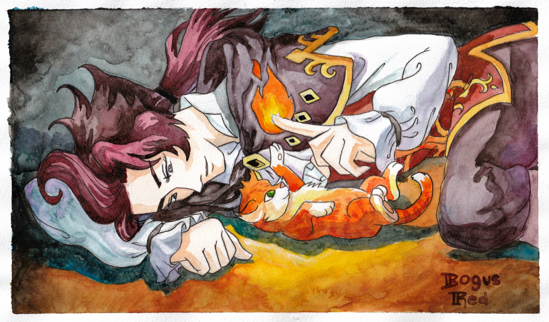
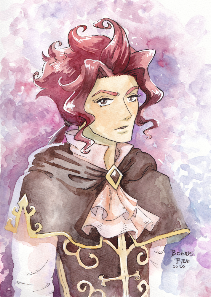
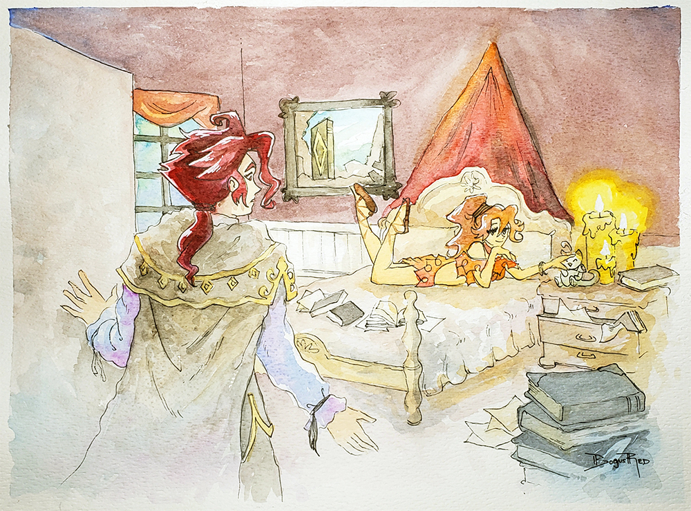
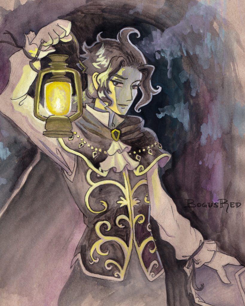
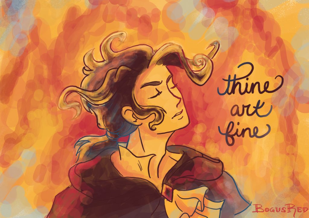
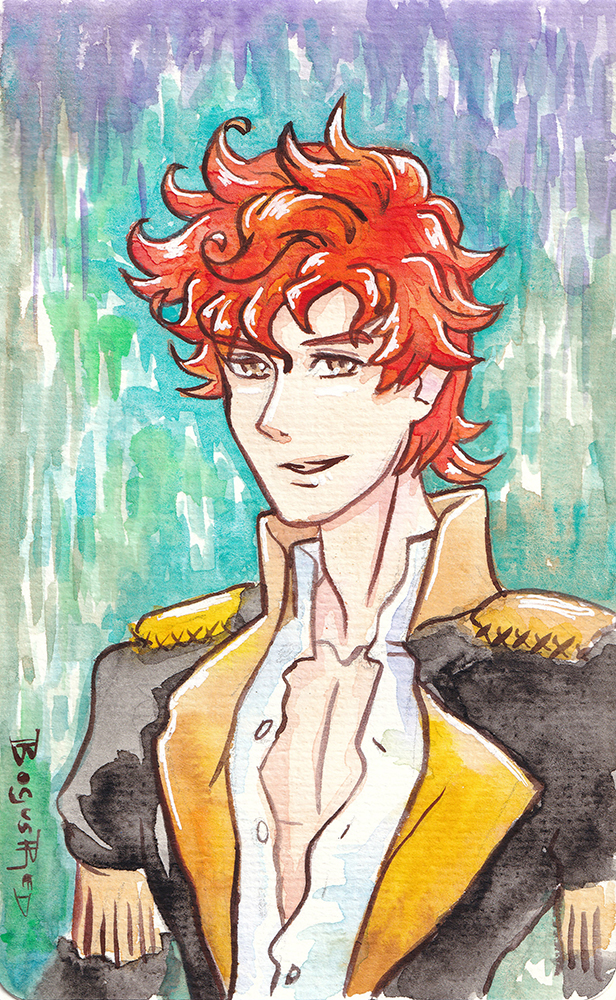
I played Octopath Traveler on Nintendo Switch in 2019 and loved it. I found myself getting attached to Cyrus Albright. I just found his personality and dialog very amusing and likable.
So I made a few fanart pieces of him over the past two years. Here they are all together. His hair is especially fun to draw and paint.
Branding is an important area for any business but especially for an online business. Your business logo is often the first thing new customers see and what they will use to form their first impression of your business. While your icon helps existing customers recognize and attribute your content and posts.
Last year I decided to rebrand PaperDemon.com because I was unhappy with what we had. Our existing logos and icons lacked personality, didn’t meet various practical needs and didn’t communicate what we were about.
Typographical logo
Up until circa 2019, the logo looked something like this and we used this for 10 years. The typeface was very thin which didn’t show up well on small sizes and it also lacked a lot of personality and character.
Circa 2009 logo
Temporarily I had changed it to this hand lettered logo in some places but it still lacked a lot of personality and was missing the wing.
2019 logo
Today’s tech world is full of forgettable logos. So often I see companies following modern trends and just copying what the big boys like Google and Apple do without doing anything unique or special.
I knew I didn’t want to make the same mistake. I intentionally wanted to do something different. The thought of reaching out to a design agency didn’t sound attractive because with the budget I am on I knew I’d get something forgettable. Even the experienced and pricey agencies may not be able to get me something that would work given that graphic design and illustration are wholely separate skills and what I wanted was something that required the skills of an illustrator.
Good thing I know someone who has experience with both (haha, I mean me). But, in all seriousness, while branding is not by any means my area of expertise I did get some experience in this area while I worked at Google and I felt confident if I focused on it I could come up with something.
I wanted to do something that was more akin to our 2005 logo which was also hand lettered. I liked the character and feel of it, but as you can see below it lacked balance. What the heck are those shapes hanging off of the P and the D? You can see this logo like the new one you’re about to see also uses Celtic letters.
2005 logo
Using an existing font and just making a logo out of that was NOT going to cut it. We are an art and writing community after all. Our logo has to be one of a kind and artsy. There’s no way I would be able to find a typeface that would do what I wanted it to do. So I knew going into this rebrand that I would be hand lettering this thing.
Some of the keywords I wanted my logo to evoke were paper, story book, fantasy, and fairy tale. Having a list of words of what you want your brand to evoke can help guide the creative process.
My inspiration for it was Celtic illuminated manuscripts, Celtic knots, and the title cards for early animated Disney films (think Pinocchio and Sleeping Beauty).
We also use a Celtic font and Celtic knots for some of our other marketing imagery so going this direction also makes things feel more cohesive.
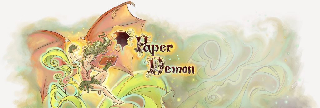
I also wanted the wing to become a part of the logo again, much like it was in the 2009 version. I also wanted the letters to have a worn out look to have a visual connection to “paper”. This was something I did for the lettering I had done for the 2020 Red Curtain Erotic Fantasy calendar project and I had liked the results so I decided to carry over those elements. If you look closely, you can see little notches in the letters.
PaperDemon.com 2020 logo horizontal
I am SUPER happy with the results of this. I fully intend to keep this logo for a while.
The only down side is, again, this logo doesn’t look the greatest at small sizes because of how detailed it is. I do have a simplified variant of it though, scaled smaller here for demonstration purposes
PaperDemon.com 2020 logo simplified version for small sizes
Social icon rebrand
In addition to rebranding the typographical logo, I also updated the social icons.
What I had previously was the wing from the 2009 logo colored green and on a green background with foliage textures. It’s something that I had created somewhat quickly back when we first created our social channels and it wasn’t very high resolution. This made it difficult to use in print marketing materials.
Circa 2015 social icon
I felt the demon wing concept was really strong as a brand element. It is simple enough that it scales down to small sizes well, is memorable, and relates well to the name “PaperDemon”. So I carried over this concept to the new icons.
Here’s the updated one using the new wing which was designed with the new typographical logo. I’m not completely happy with the colors so I might change the colors/textures again later this year. But the overall shape of it is pleasing.
2020 PaperDemon Icon
Site footer
For many years, PaperDemon.com had a demon illustration in the footer along with the logo for the site. This illustration would get rotated out with a new one every now and then. Over the years, this tradition was stopped due in part to my artist block, my time constraints, and also due to complexities involved with making the site layout work well on mobile.
I’ve had a strong desire for years to bring this tradition back and with the launch of the new logo, decided now was a great time to do it. I also had a great demon illustration I had created recently that made for a good fit. So this is the new footer that now resides on the bottom of PaperDemon.com. The advantage is I can make the illustration and the logo pretty large to show off it’s detail because it appears in the site footer as opposed to the header where it might be annoying for users to scroll past constantly.
I hope this post inspired you to thoughtfully consider your branding for your own business or website.
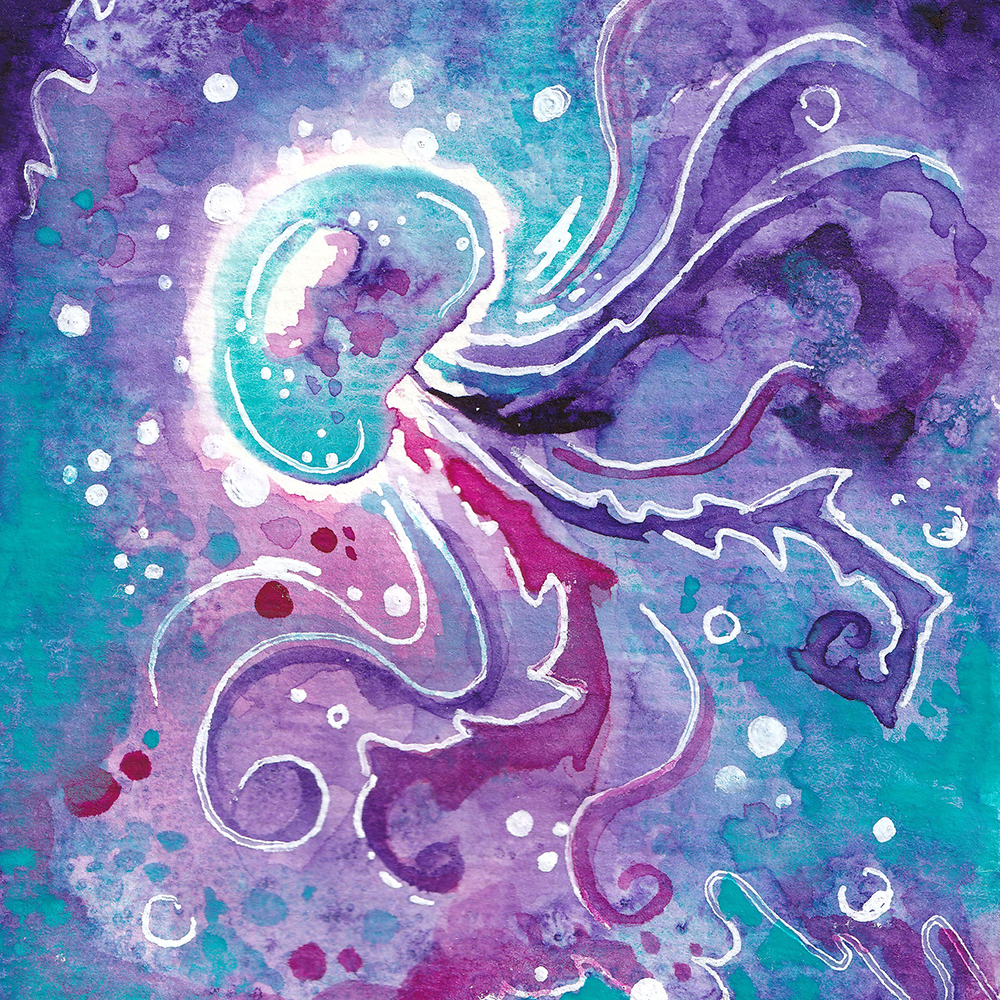
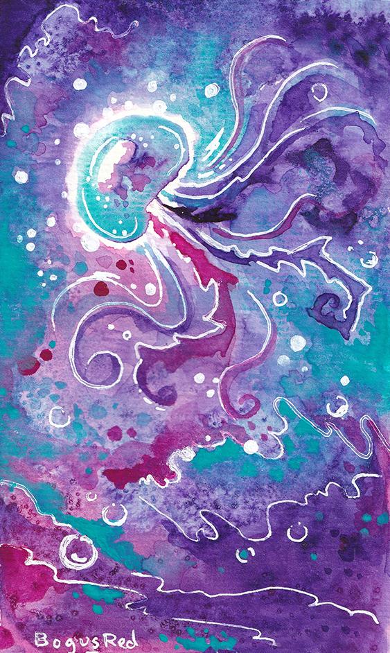
I attend weekly group therapy video calls and I’ve taken to doodling in my little watercolor sketchbook during them.
I recently bought myself a starter set of 6 QoR high chroma Watercolor paints after seeing a few Youtube artists pimp them and did a little experimenting with them. The above jellyfish painting was the result.
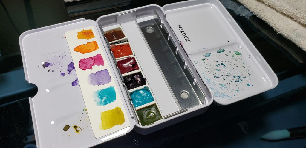
I don’t like to work from tubes (too chaotic and wasteful) so I bought myself this little empty pan set and squeezed the paints out into pans.
This is something I stupidly never thought you could do. I always thought people who used paint from tubes were either ok with the waste or perfect at estimating how much paint they’d need. It wasn’t until I saw Art youtubers like Emily Artful tour their supplies that I learned this was a thing. So I pass on this knowledge to you!
Beware though because apparently not all tube watercolor paints work well in pans. Do research first.
A few (early) conclusions on QoR
With the QoR, there’s a ton of pigment in there and it lays on DARK. There is high paint load in these, which is a nice contrast to working with Winsor & Newton watercolor (my usual jam). I feel with the Winsor & Newton pan paints, I have to do several layers of colors like purple, blue or green to get the bright, rich, intense color I want. Which is frustrating if you’re like me and like to rely on the lovely bleeding/blending effects of watercolor which can’t as easily be done if you have to do it in layers (or maybe I’m just not good at doing it that way).
It also spreads out very fast, which can create some beautiful blooms. I still have some more experimenting to do with it. But this will make them harder to control.
They react well to salt, maybe even more so than Winsor & Newton.
I was also surprised to discover the Cobalt Teal is opaque allowing me to paint light on dark. It felt more like a gouache. I also love the Cobalt Teal and Quinacridone Magenta because these are colors I don’t have available in my Winsor & Newton pan set.
Do I like the QoR paints?
YES! I LOVE bright colors so these were the perfect paints for me to expand my collection with.
But I need more practice with them. This jellyfish doodle just doesn’t do the paints justice. More experimentation to come.
Do I recommend you buy QoR watercolors?
If you’re new to watercolor medium, these are not the paints I would start with. There aren’t enough variety of colors here, they’re harder to control and lift, and they’re pricy. But if you’ve already gotten your feet wet and are looking to expand your colors or options, these are definitely worth checking out.
Medium: QoR high chroma watercolors, white jelly pen
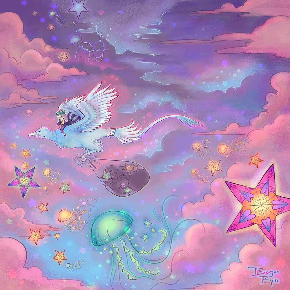
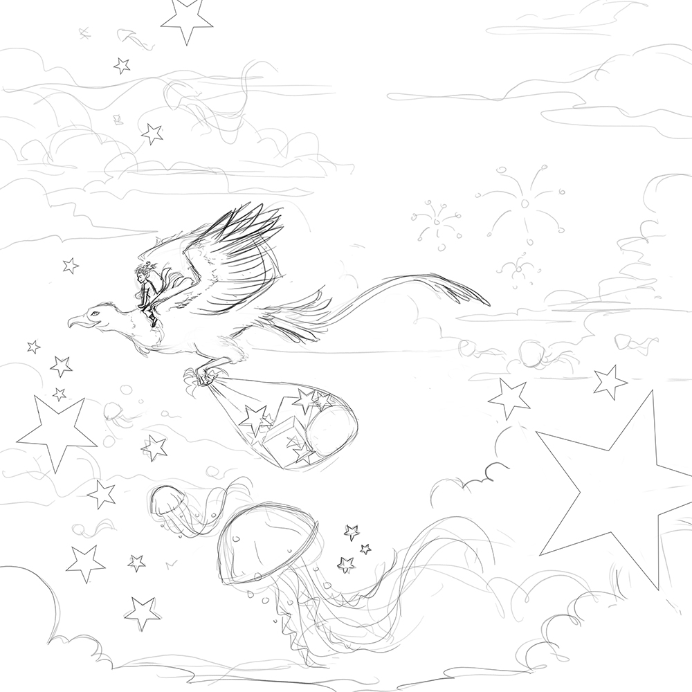
This art has my original character, Jerle, flying on a Dracostryx named Flurry. This was my first time drawing a Dracostryx.
The jellyfish and stars are meant to be lanterns. Why jellyfish? Because that’s what I like to draw.
ewe
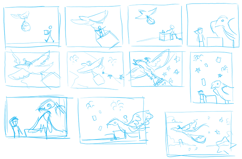
Thumbnail sketches
I start as I usually do, doing a series of thumbnail sketches. My simple dracostryx looks pretty cute.
owo
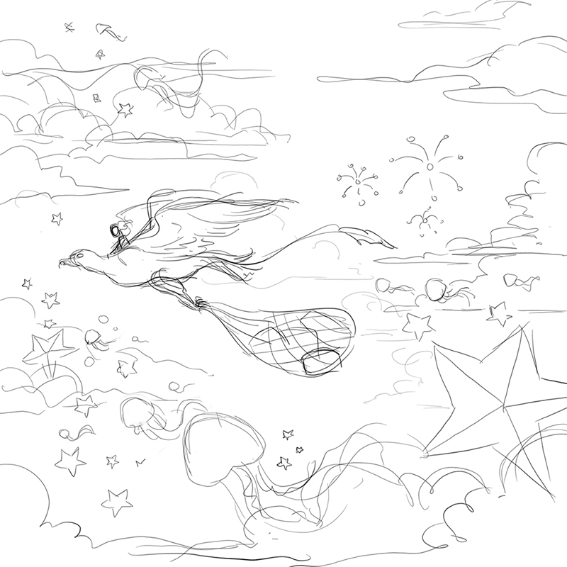
Sketches
My process here is not out of the ordinary. I take my chosen thumbnail sketch, scale it to fit the canvas, drop the opacity, and draw on top on a new layer.
I then take that layer, drop opacity, and draw on top of that to do more and more refinement. You can see here the stars look perfect. That’s because I used the shape tool. The final line art is basically me tracing the stars with a pencil brush
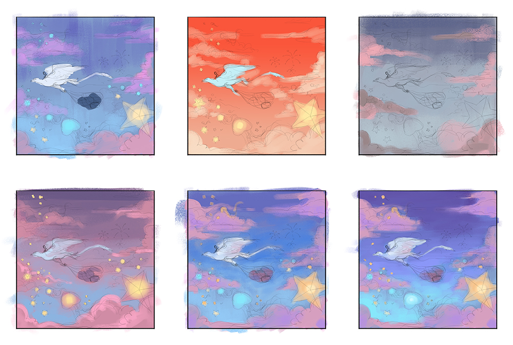
Color Comp
Many of these look pretty similar. This is because I had an idea in my head of generally what colors I wanted but needed to experiment a little to narrow it down more. Typically when I do color comps, the options vary a lot more.
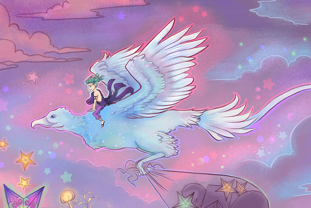
Finished piece and details
As you can see I ended up dropping the fireworks and added more layers of clouds. I felt the stars was already making the piece too busy and there were already too many different elements (the dracostryx, the star lanterns, the jellyfish lanterns).
A lot of the glow effects are achieved by using my brush on “screen” mode with a bright color. The rounded edge stars were done with a custom star brush.
Full finished pieceDetail
I really love the way that the subtle color changes turned out on the Dracostryx. That’s it for now. Bye bye o/
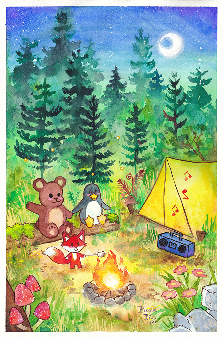
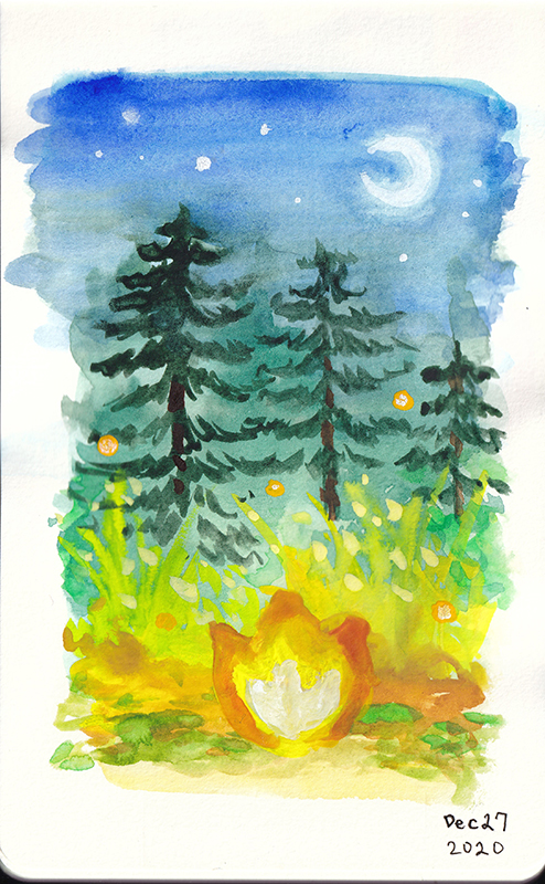
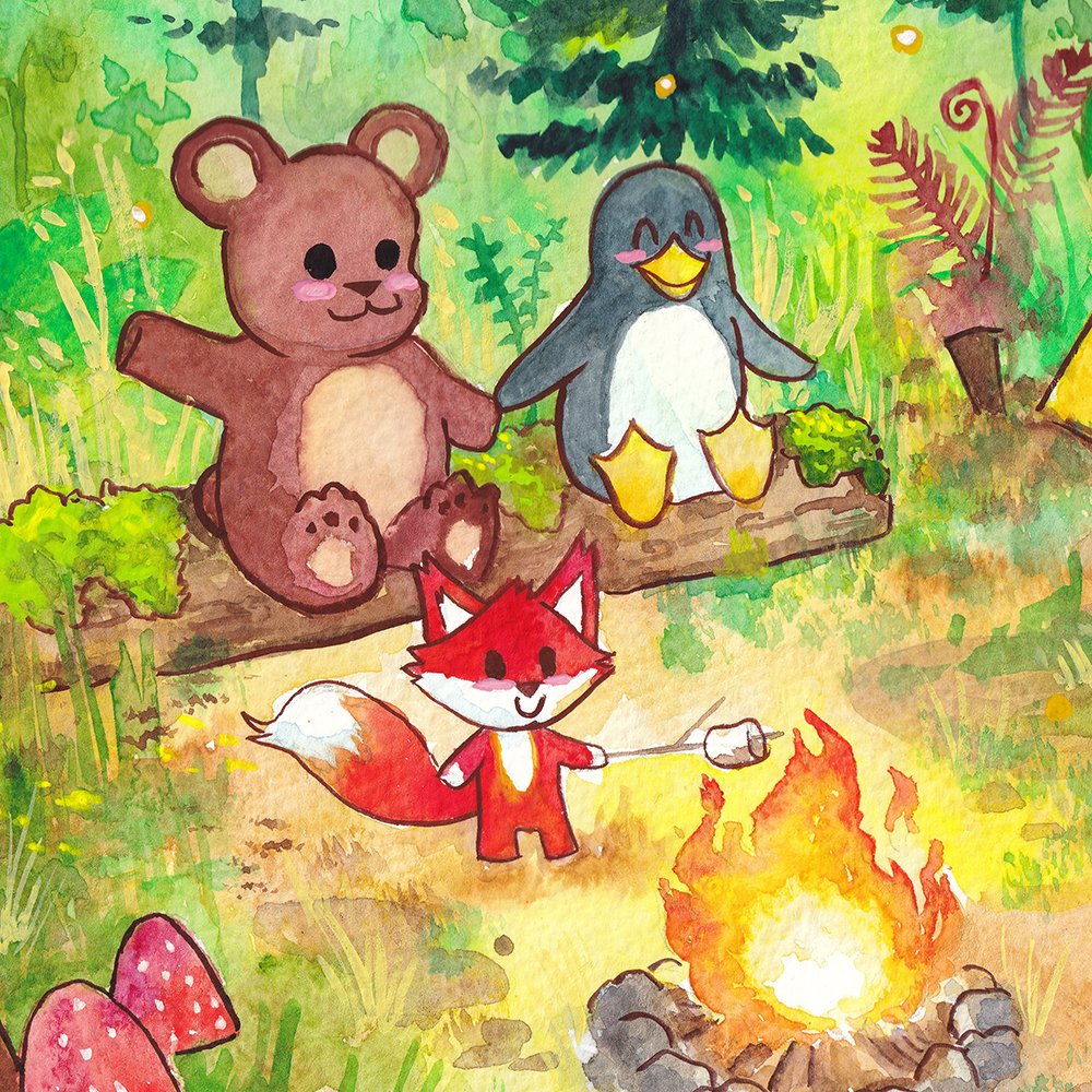
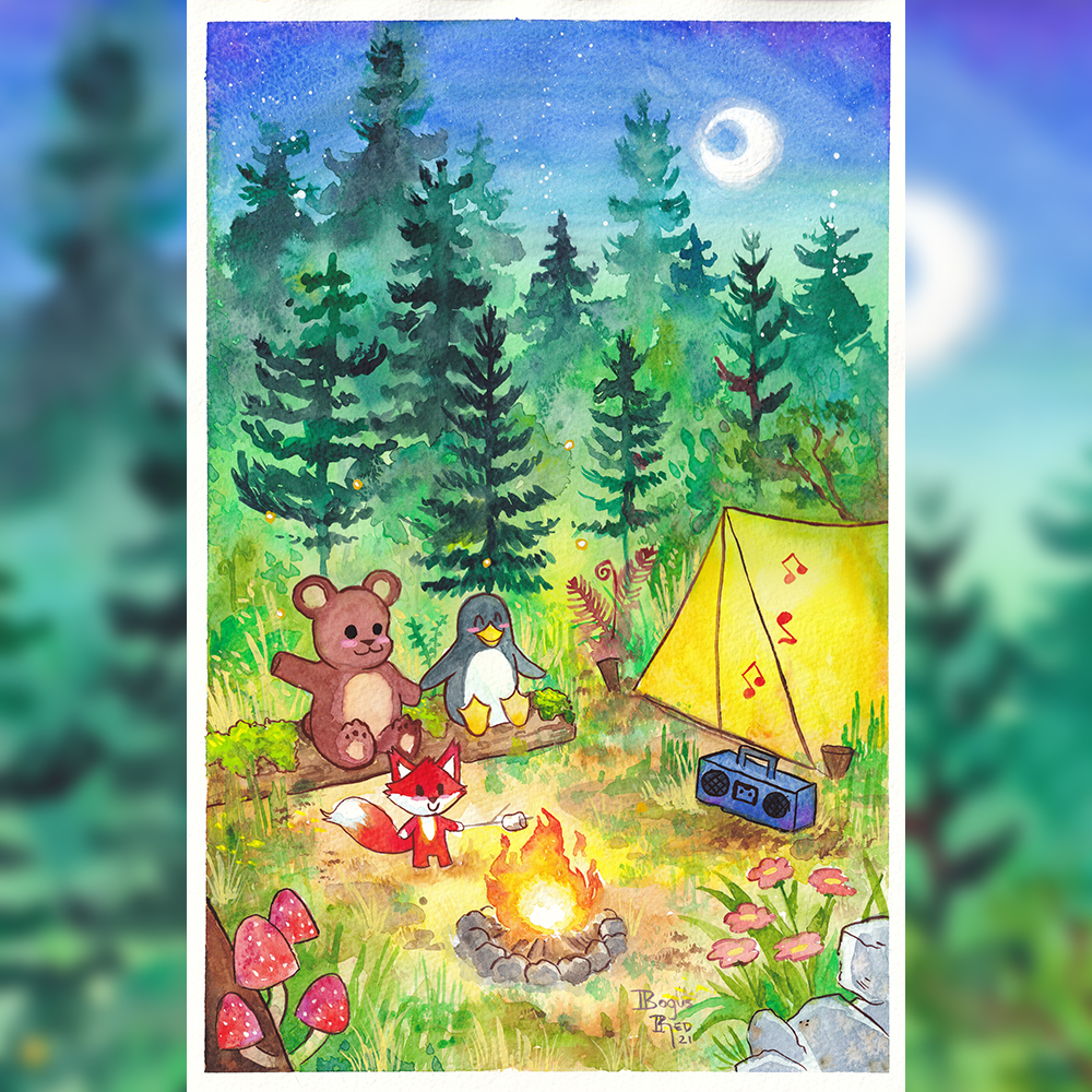
Here’s the first finished art piece of 2021. This piece is dedicated to Wilder.
This is a gift for my new nephew who was just born a few weeks ago. This will hang in his nursery. His parents love the outdoors and camping. They also love penguins and bears so I combined these loves together into a unique gift just for their family.
Medium: Winsor & Newton Pan Watercolors, Holbein Gouache, Winsor & Newton Gouache
Paper: 300 Series Strathmore Watercolor paper
I thought I’d detail behind the scenes how this art piece was created so you can see what my process is like. I’ll eventually create a time lapse video of the final painting.
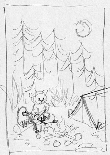
It all started with a thumbnail sketch. This is only a couple inches tall. I start most illustrations doing thumbnail sketches to try different compositions and ideas. For most illustrations I’ll do several thumbnail sketches until I land on something I like. For this illustration, I had the basic composition in my head already and one thumbnail was enough.
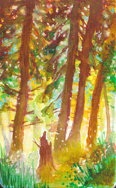
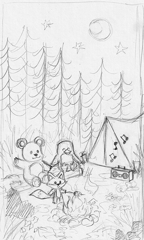
I then went on to create a more refined sketch in my sketchbook to better work out the composition in more detail. The composition roughly follows the rule of thirds with the forest and sky taking up the upper two thirds of the paper.
The elements in the illustration are personalized to the family that this gift is for. They love the outdoors and camping. They had decided to paint the nursery green and go with an outdoors theme. Wilder’s dad loves bears and Wilder’s mom loves penguins so it only made sense for them to be there. They also love listening to music. At every family gathering they’re supplying the music.
I included elements on the lower left and right to help frame the composition. I intentionally chose for the trees to have a diagonal line down toward the right which helps lead the eye into the tent and music which leads your eye into the main focal point of the piece, our little critters.
I chose a fox because of the bright colors and contrast it would have against the greens.
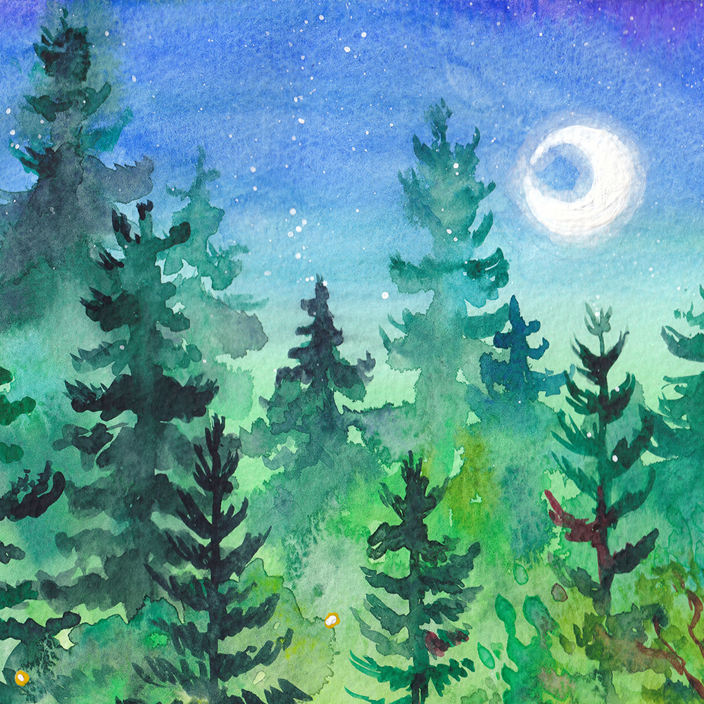
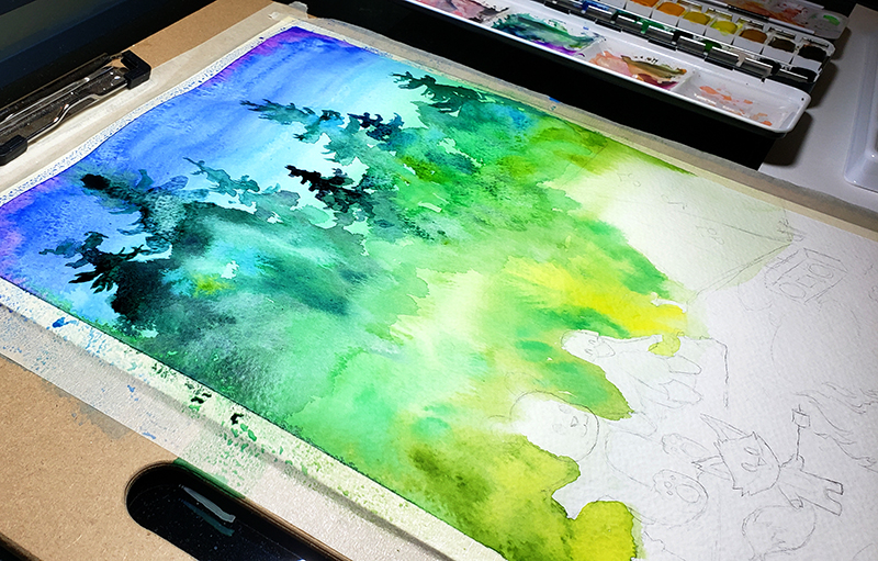
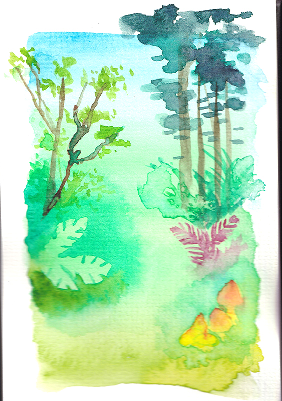
As you note in the final piece, the trees in the distance look almost like they’re in fog which creates a lot of beauty in the piece. This is achieved by using wet on wet techniques for the trees in the distance and using wet on dry technique for the foreground trees.
Part of the technique for making this look so beautiful is letting the colors bleed into one another and is my absolute favorite aspect of watercolors. I’m big into color and nothing gets my jimmies going like seeing all those pretty colors bleeding into one another.
Detail of the final illustration showing the trees bleedingWork in progress image showing the trees in the distance painted in
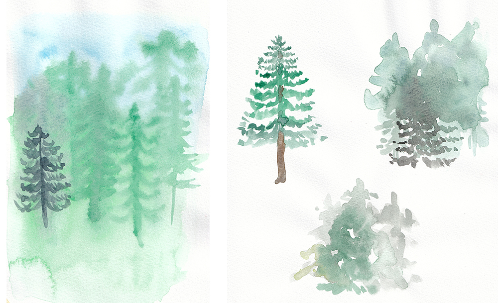
I watched this tutorial on how to paint pine trees with watercolor and found it incredibly helpful. I’d never painted anything like this before so I needed to get some practice with it before starting the final illustration. I made several attempts, some of which were failures but I wanted to share these so you can see that it’s normal and part of the process to have failures like this. This is why many professional illustrators will do practice studies like this so you can work on the new techniques in isolation without worrying about ruining the final piece.
I realized after these attempts that the cheaper watercolor paper I used for the practice may have contributed to the lackluster results. These were done with Winsor & Newton watercolors on Soho sketch series paper (it’s not very good paper for final pieces but is ok for practice).
For many illustrations that I do, I do a series of “color comps” or “color studies” to try out different combinations of colors to see what will work best together. Sometimes, I have a clear idea in my head of what the colors should be. I went ahead and did a quick color study to test out the colors. I only did one color comp this time because I was satisfied with the first one.
The colors didn’t bleed as nice here because I ended up using the wrong side of the paper by mistake. Oops! But regardless, I was happy with the overall color structure.
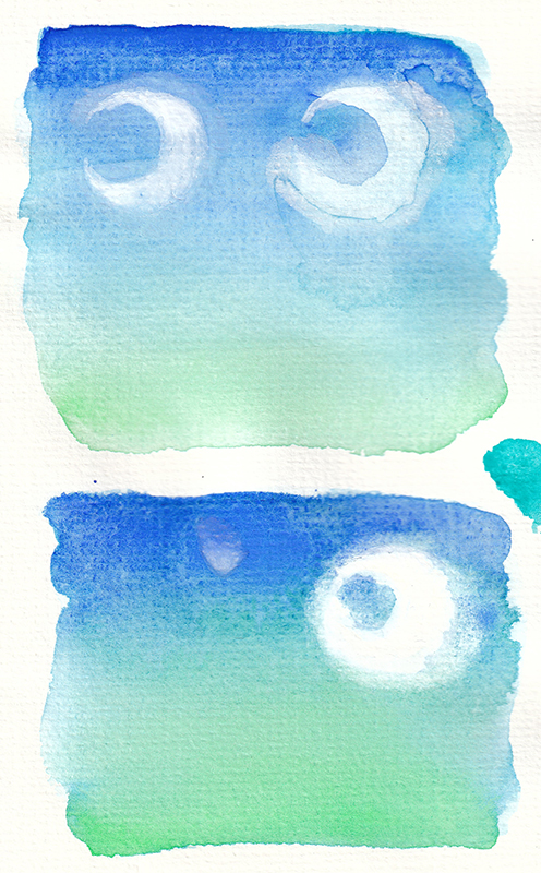
I also did some practices with painting the moon. In order to get a smooth sky, I would not be able to simply avoid painting over the moon. Painting the sky required straight smooth strokes wet on wet. So I’d either have to mask it or paint white on top or lift the paint to get the moon.
I experimented with a few options:
Using masking fluid – wasn’t happy with the edges after using this. The edges were not smooth. And it’s also annoying to work with.
Lifting the paint – this was ok but resulted in weird edges from the paint drying. It would have been too hard to control and disrupt the smooth sky I wanted
Painting the white on top of the sky with gouache and/or white ink. – I liked this result the best so went with this for the final.
Moon studies. Top left : white ink. Top right: lifting paint. Bottom: masking fluid.
Something I didn’t include here is I also did several practices of the sky by itself attempting to get a smooth gradient using wet on wet techniques. The moon studies also served as additional practice for this technique.
I also did a study practicing some foliage. I wasn’t totally happy with the foliage I ended up with in the final piece. I think I could have used some more practice here but I had already invested what I felt was enough time in learning new techniques that I was ready to just move on to the final.
When I was ready to work on the final, I redrew my sketch onto the watercolor paper. I didn’t want to do the initial sketch on watercolor paper because a lot of erasing can disturb the surface of the paper and influence the way the paints sit and bleed. So I had to redraw (in pencil) onto the watercolor paper.
The vast majority of the piece was painted with watercolors. But outlines for the characters and the yellow grasses were painted with gouache. I used gouache for the outlines because it gives me a consistent dark line, something that’s hard to achieve with watercolor. I also used it for the yellow grasses because gouache is opaque which allows you to paint light colors onto dark colors. That’s something you can’t achieve with watercolor because of it’s translucency.
The stars were achieved by using white gouache and splattering them onto the page.
Here are a few things I thought could be better with the piece
The foliage. I wanted to articulate ferns and larger leaves but struggled to indicate them and ended up lifting paint from some of my foliage attempts. I need more practice with this.
The sky wasn’t as smooth as I wanted. I ended up smearing the trees a little but I suspect no one noticed.
Making the fireflies greenish blue instead of orange and making them more prominent.
The shapes of the trees could be better. I need more practice with this.
And there you have it. The finished piece. This was definitely my most ambitious watercolor painting. Overall I’m happy with the results and I’m glad I attempted it. It definitely gives me more confidence in working with watercolor.
I hope you enjoyed this write up and learned something from it. Happy painting.
On Tuesday I start my new internship at Google. I’m really excited about it. I can’t wait to meet the other interns and learn what life is like as a Googler.
I am really proud to be working at Google. My manager is the guy who does all of the Google holiday logos! Can you believe that?! That is AWESOME. I’m looking forward to working with him and learning the secrets of the Google doodles. Every time I think about the fact that I’ll be working at Google I pinch myself just to make sure I’m not dreaming.
Another Google intern sent me a link to this cool site called Gintern.net that displays all the Google intern blogs.
There are a lot of things I’m looking forward to learning this summer. I’m told I’ll be making a lot of icons and such. I don’t see myself as a really great icon designer so I’ll get a lot of practice and learn all the tricks. I’m hoping to take what I learn at Google and apply it to PaperDemon.com to make it easier for members to post their artwork and such. I’m also looking forward to trying out the hardware. I hear they use Tablet PCs for drawing and I’ve never drawn on one before. If I like it, I may buy one for myself. It will be nice to have a little computer to use as my sketchbook. I will be able to do watercolor without carrying around a paint set! I like painting digitally better than painting traditionally anyway.
Another thing I think I will buy is that Reason software for making digital music. The music programs I have now are so crappy. That is part of the reason why I haven’t posted any new music in the music section of my site for a long time. I’m waiting to get some better software with a better piano sound font.
Google gives free meals every day for employees and I’m hoping I don’t gain any weight.