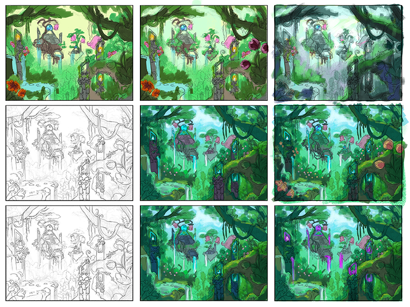
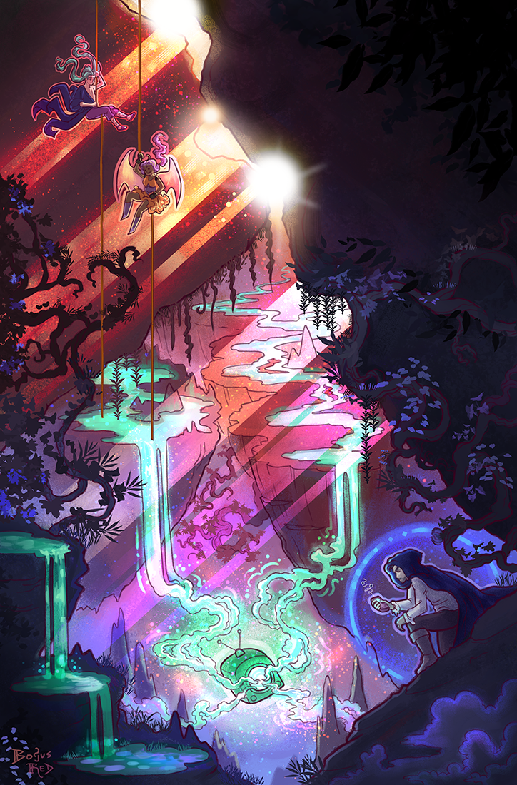
Jerle and Willow rappel down to investigate the rootways underneath the city. They discover a portal underneath the city is draining power away from Aridin’s orbs. Adrian, the Black Bandit is nearby and Willow suspects he’s behind all this given how suspicious he looks. But Adrian is just there to investigate the situation too.
You trace the energy drain to its source– somewhere down in the city below. The roads themselves feel rich with energy, and you discover that the power has sunk beneath the surface of the city down into the roots below. To your surprise, you discover intricate, recently grown tunnels of roots that stretch under the city in a complex labyrinth. Who has built them? Why? How are they taking the orb’s power? Draw or write about your character investigating the root tunnels below the city. Your piece must include your character and either the root tunnels or those responsible for them.
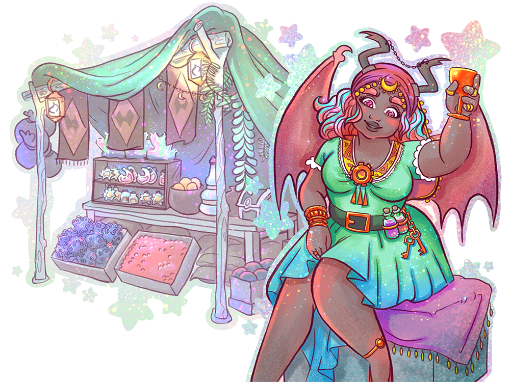
Here’s a new NPC I’ve created for the PaperDemon Art RPG. Her name is Keziah Amin. I still need to flesh out her personality. I have some basic traits written down but she’ll probably get more fleshed out through role play in some upcoming PDARPG events.
We’re going to introduce a new traveling merchant mechanic on the site soon where you can get discounts on some featured items for a limited time.
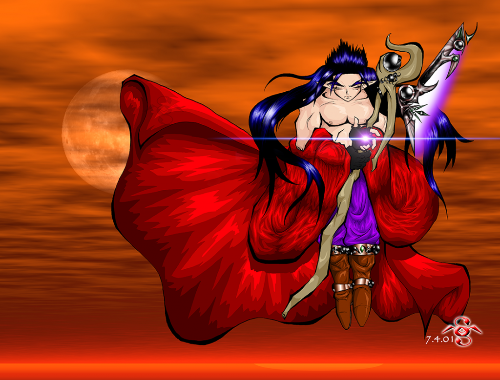
This is the original art I made in 2001. Back then my art had a lot more Akira Toriyama influence. You can see the basic concept I had for weapons in the game exited from a long time ago. The background in this art was generated by Kais Power Tools if I remember right. I wasn’t very good at making backgrounds back then.
Jerle weapon / 2001
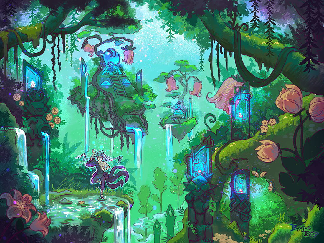
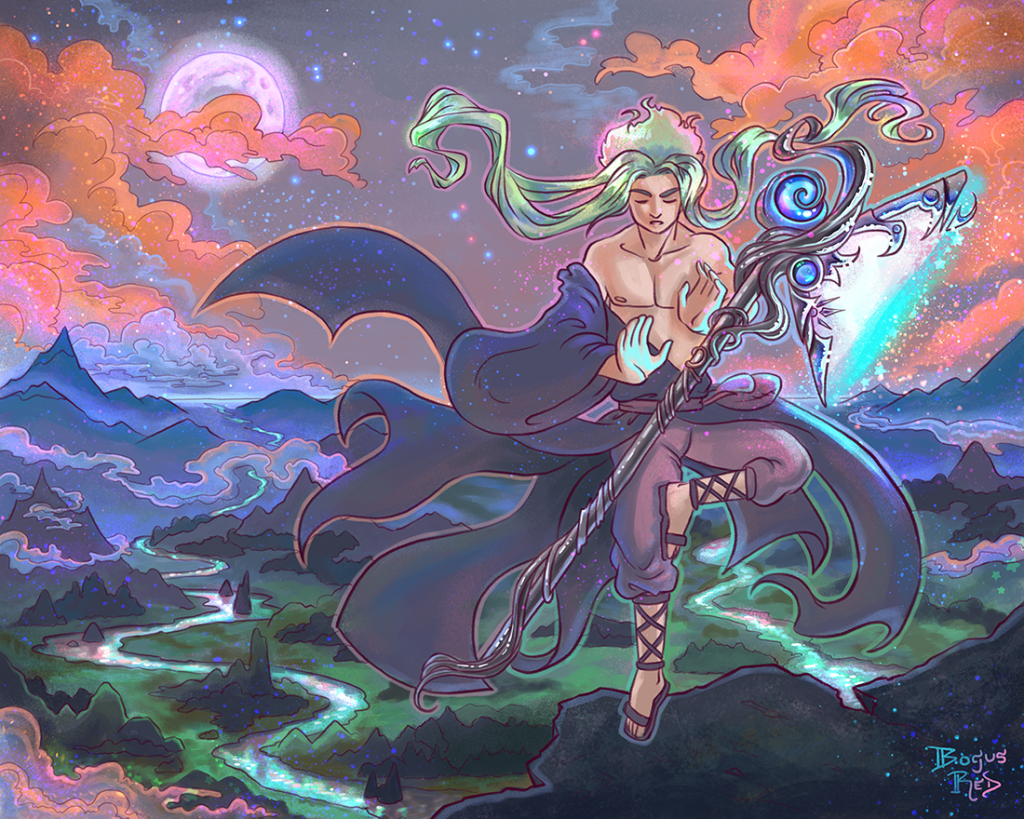
And this is the redrawn version with a background I drew and painted myself. Jerle’s clothing was redesigned a couple years ago to look a little more interesting by having tails and an asymmetrical design. Usually I don’t draw his hair this long though.
Jerle weapon / 2022
I rarely do redraws. I’m really happy with how this turned out and may do another one.
As for life updates, I had a baby in February! I should probably make a post about that. I’m also struggling with postpartum depression. Need to make a post about that, too.
Some day I’ll make a good habit of posting to here more consistently.
I’ve just published a new video where I cover 10 steps pro artists use in their art process to create professional art.
10 steps pro artists use to create amazing art
This is a condensed version of a Livestream I hosted a few weeks back.
After nearly a year of no streaming or videos I decided to come back to livestreaming.
I originally stopped for a few reasons. I found the process of creating YouTube videos quite time consuming to make them at the quality I really wanted them to be.
Livestreaming was a bit of a mixed bag. When I did “chill streams” where I just hung out and did art, I felt it didn’t really provide value to the PaperDemon community so I ended up not promoting the streams, this getting very poor engagement. I also found it was not so great for my anxiety because I was needing to be social, rather than having planned content to talk about.
When I did educational Livestream I felt more comfortable because I planned the content ahead of time and was confident that the content was valuable educational art content. But doing these streams regularly was also time consuming due to the planning involved.
Interestingly I found that even though I hadn’t posted to YouTube for a long time, we were still getting new signups to paperdemon and the discord from these videos compared to our other social media marketing efforts.
I think this is because the content is more valuable and more evergreen. On twitter, Facebook, and Instagram, posts typically only get seen for a day or two, then are forgotten about. But content on YouTube is continually searched and discovered even years later.
Because of this I decided to come back to livestreaming and YouTube videos in an effort to market PaperDemon.
But to be more realistic I’m only planning on one Livestream per month with quality educational material and demos along with an occasional extra video here and there. This is a pace that feels reasonable to me.
I’m also experimenting with YouTube shorts to share shorter advice stuff.
I may have to take another break when the baby comes but we’ll see. I may be itching to do videos. Livestreaming might be hard to coordinate around feeding and nap time.
I decided to stream on YouTube going forward instead of twitch because I’ve heard so much from the experts in this space that twitch has poor “discoverability” compared to YouTube. Plus it makes things so much easier. If people subscribe to my stream, they’re also subbed to my videos and vice versa.
My next stream will be this Saturday 11am pst and I’ll be talking about composition, a topic requested by a member of the PaperDemon community.
My passion for PaperDemon comes from the pain I felt as a child, not really fitting in, feeling stupid, and having poor self esteem. With the discord server we can really provide support for those that are struggling and help members to see themselves more positively. The community is so wonderfully supportive and I want to grow it further.
We’re getting a lot of new sign ups on the PaperDemon website but a small percentage of them are in the discord server.
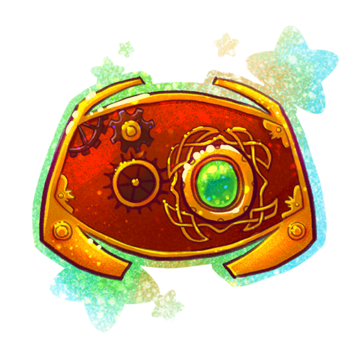
So to solve this I want to promote paperdemons discord server more prominently on the homepage. Since the icon will sit alongside all of our other major game icons, I wanted it to match the PaperDemon art rpg look and feel (fantasy and steampunk) so I created this icon. I thought it turned out pretty good.
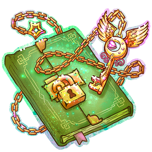
On PaperDemon we just introduced biweekly challenges as part of the PaperDemon Art RPG where a new prompt is introduced every two weeks that encourages players to explore their OC’s personalities and preferences.
But anyway here’s the art I created to signify these challenges.
Since these challenges centered around character development, Shyftlock suggested a “journal” be used for the graphic. But after doing some research I decided to go with something more like a locked diary to give it a little more of a steampunk feel.
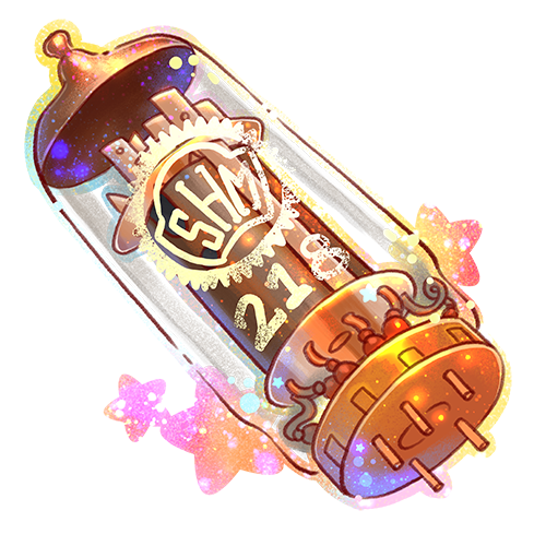
I created a new item for the PaperDemon Art RPG called a Junket Tank. The visual is based on a vacuum tube like one that might be used inside a tube tv.
In the PaperDemon universe, portals to other worlds are tube television sets. Some portals are unstable, only able to be visited during specified times of 2 months.
I had the idea to add an item that would let players visit these closed portals and one of our members, Duskfire suggested it be a part from a TV set.
The “SHM 218” is a reference to ShrunkenHeadMan club, the San Jose State University Animation/Illustration club that I was very active in while studying there and have still contributed to after graduating. I’m not as active these days but try to make it to the yearly SHM Con event at least.
Soon we’ll be introducing a new crafting challenge to the PaperDemon Art RPG. And so I needed to create some new item art.
I have a lot of fun creating the item art for the PaperDemon Art RPG. Part of it is because it’s a lot easier than character art, I can get fairly creative with it, and I can usually finish an item in 1-2 days.
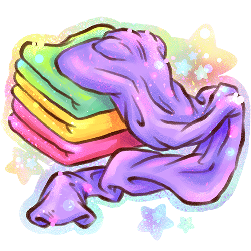
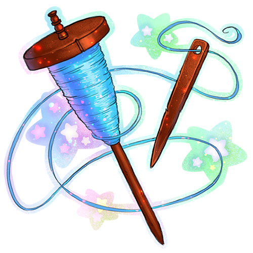
ClothThread
The spindle for the thread was inspired by ancient thread spindles.
The only thing I wish I had done differently with the art is that the lines for the cloth are too thick compared to the other item art. I might have to go back and fix that later.
Anyway, you can craft Cloth and Thread together to make this Cloth armor.
I did some art for two currencies for the PaperDemon Art RPG.
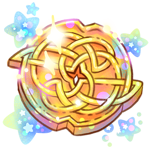
We’re using Gold as the main in-game currency. Gold drops for participating in most of the events. I was inspired by Celtic knots for the design as well as Japanese coins, some of which have a hole in the middle. Celtic designs are an influence in other PaperDemon Art RPG assets as well.
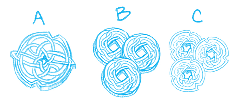
I actually had three different concepts that I was trying to choose between.
Three different concept sketches for gold currency
I went for option A because I thought it felt more Elvan. I also thought this worked better as a singular coin instead of three coins because of the level of detail in it.
I may still use option C for another currency later. I liked the little notches.
And here’s the final.
Final art for Gold
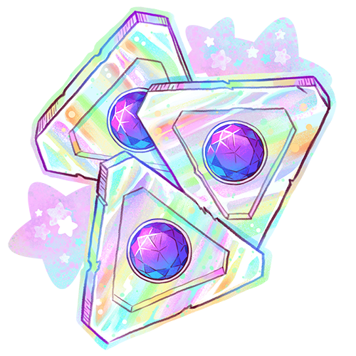
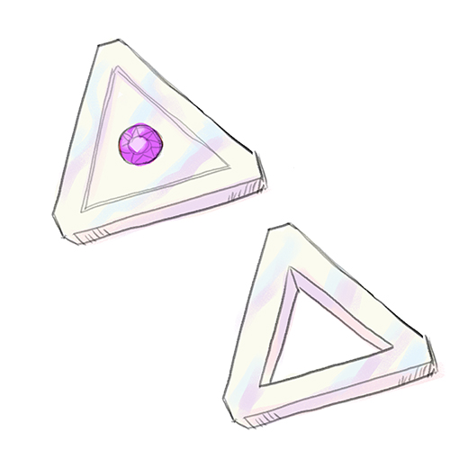
And soon we’re going to introduce a new premium currency called “Trokens.” I wanted the currency to have a non-circular shape just to be a little more interesting. There was a conspiracy involving me and Triforces in the past so I thought it would be funny to make the currency triangular shaped. When I told my husband I was trying to come up with a name for the currency, he suggested “Trokens” because it’s a combo of tokens and triangle and we both busted out laughing. So I rolled with it.
Here are two early concept sketches. One had a gem in the middle and another had a hole in the middle, again kind of like the Japanese Yen coins. I ended up going with the gem in the center as this felt more “premium”. Also I like shiny things and gems are shiny. I was thinking of the base as being like a pearlescent material.
Trokens Concept sketches
And here’s the final art. Once again I turned up the rainbows and sparkles to level 11.
Trokens final art
I’m pleased with the art and can’t wait to announce these for sale. Hoping to officially launch the store in the next week or two. However I’m still building out the list of items that will be available for purchase with this currency. So I’m unsure how interested people will be in buying at this point.
 Minimaid for lending me your character Adrian!